RENÉ
Сучасна інтерпретація ресторану
в стилі шале
Концепція ресторану — це сучасна інтерпретація стилю шале.
Протягом усього процесу дизайну концепція розвивалася та вдосконалювалася, адаптуючись до простору та амбіцій закладу. Нашою метою було створити інтер’єр, який балансує між розкішшю та комфортом, поєднуючи вишукану елегантність із відчуттям затишку.
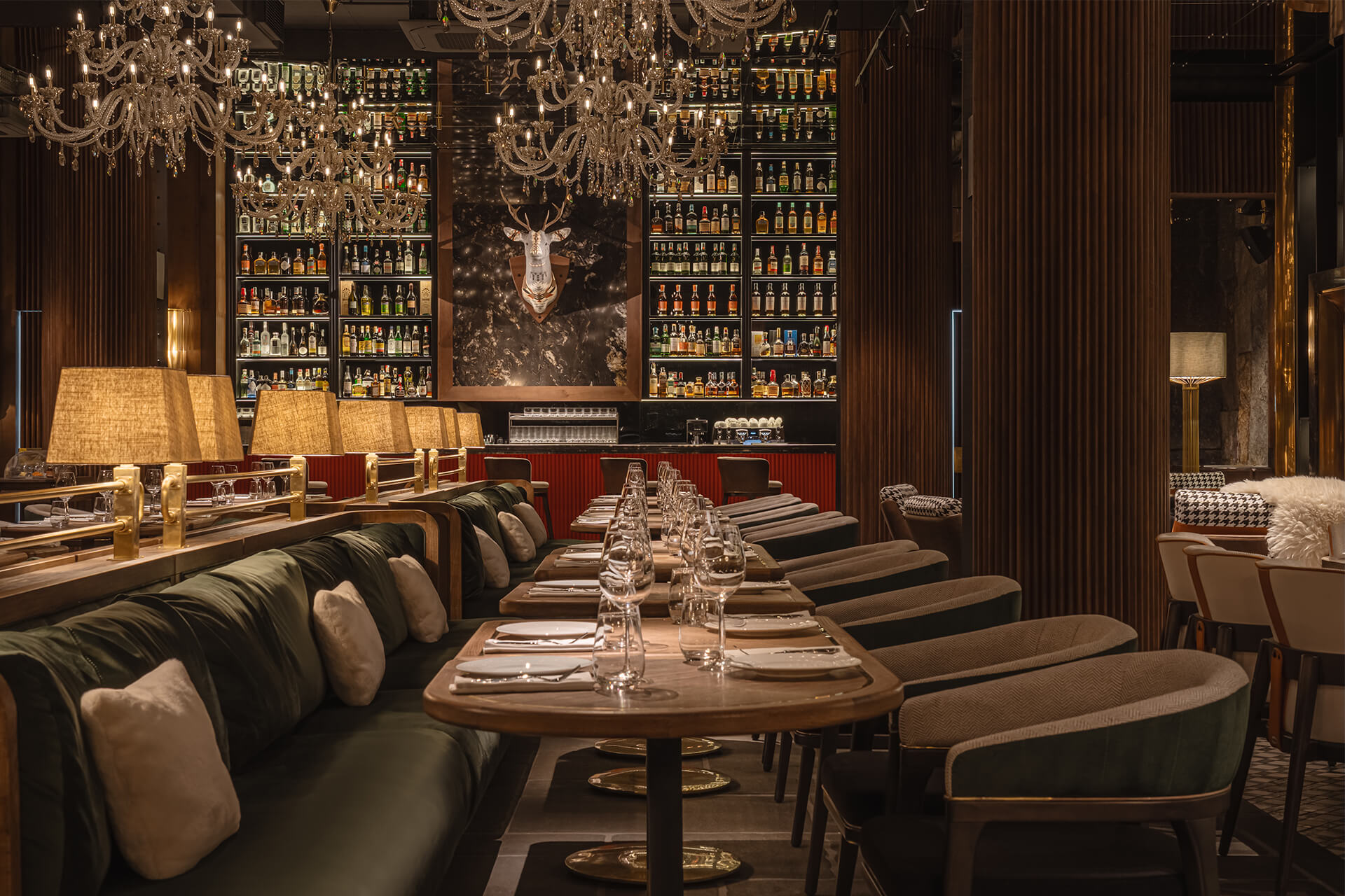
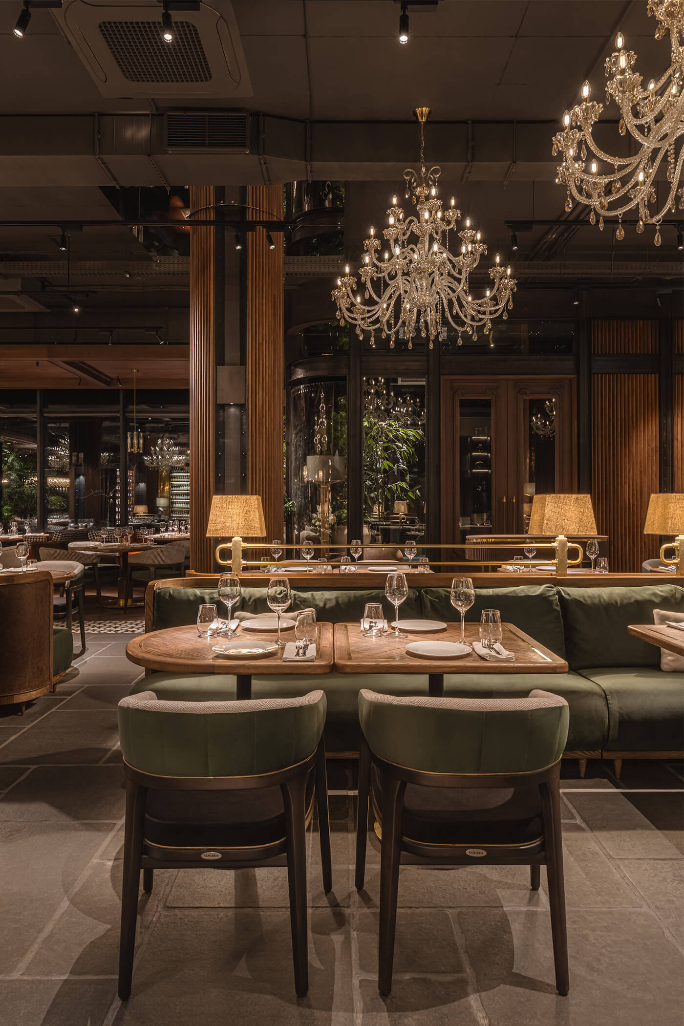
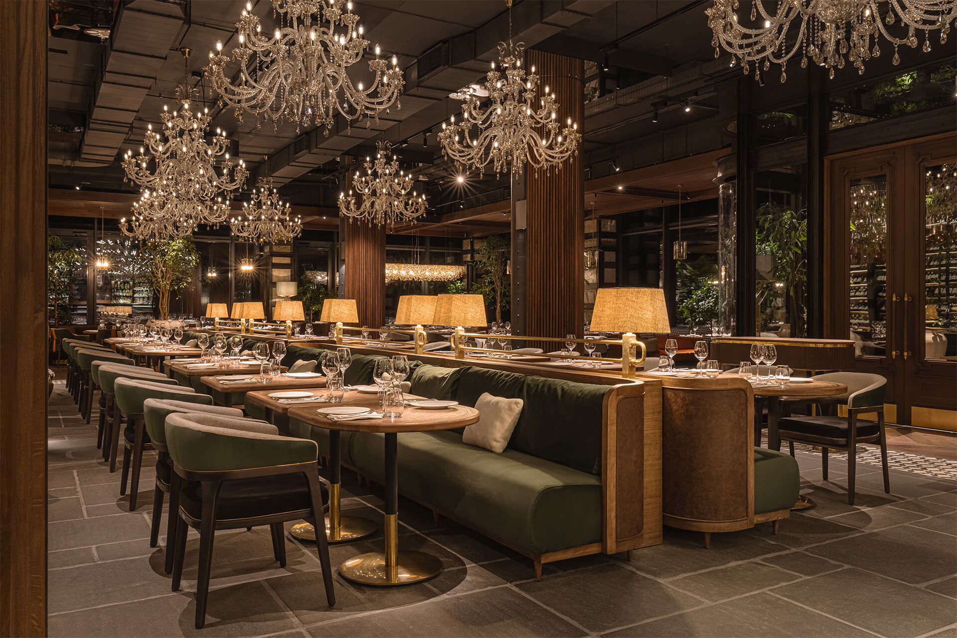
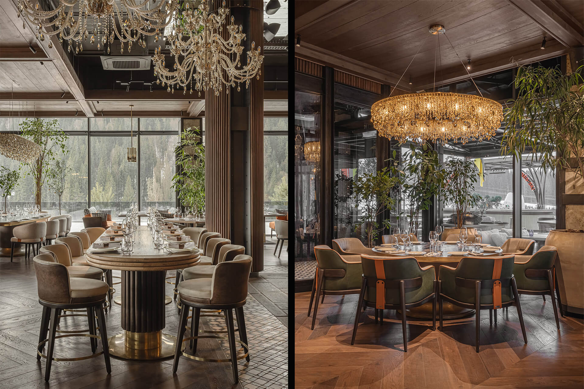
Простір побудований на контрастах: велика кількість дерева та металу, поєднана з індустріальною стелею в центрі залу, створює атмосферу стриманої, брутальної розкоші. Водночас ці індустріальні елементи пом’якшуються класичними та неокласичними деталями, що робить інтер’єр багатошаровим та візуально насиченим.
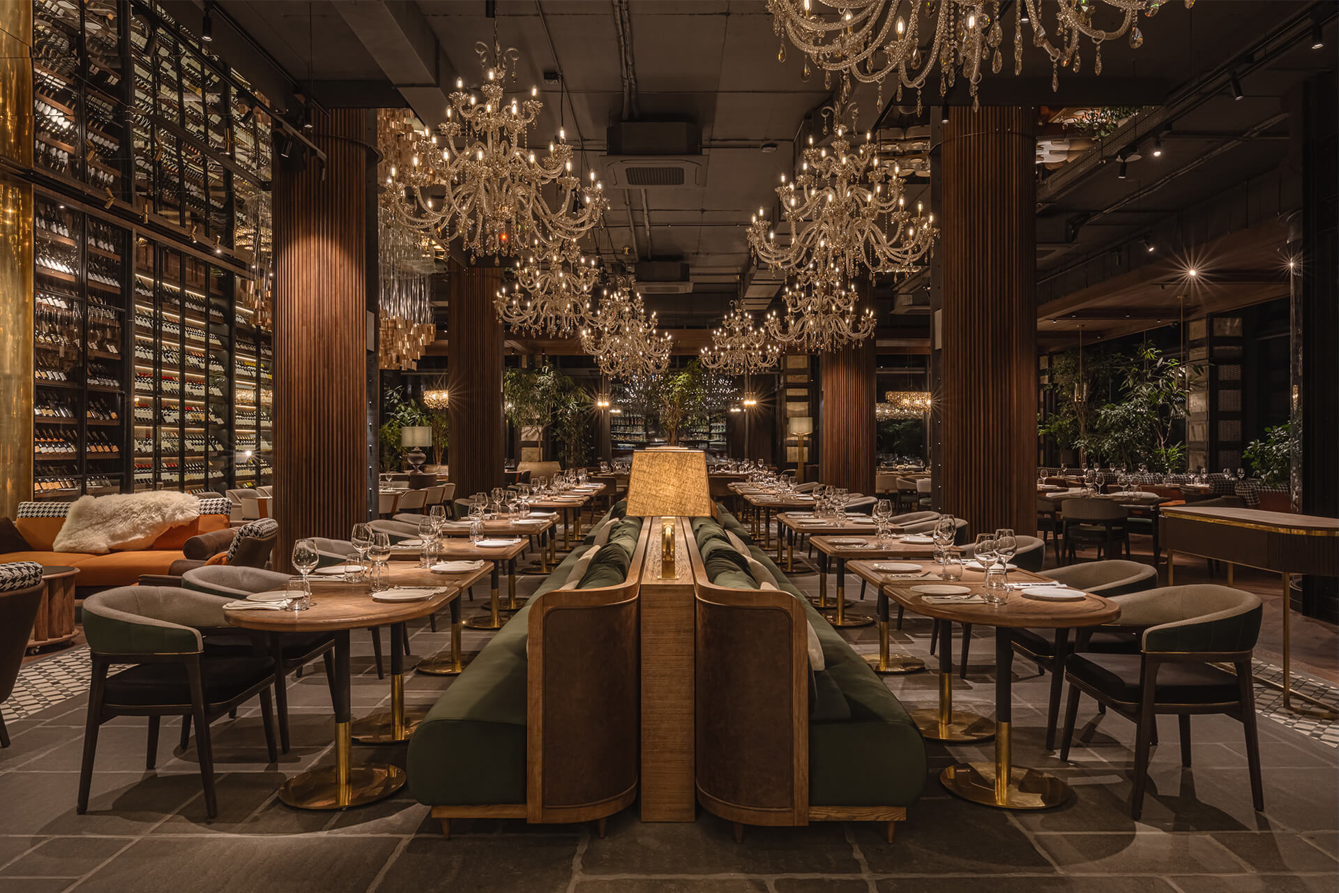
Ми приділили велику увагу кожній деталі, формуючи складну та багатогранну композицію. Інтер’єр ресторану задуманий як насичене, занурююче середовище — таке, яке неможливо сприйняти повністю за один візит. Ця свідома складність підтримує інтерес гостей і підкреслює унікальну ідентичність закладу.
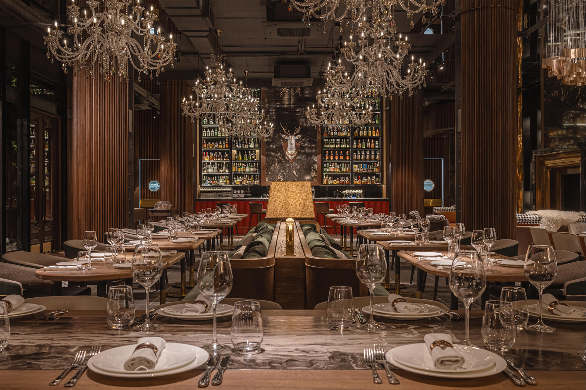
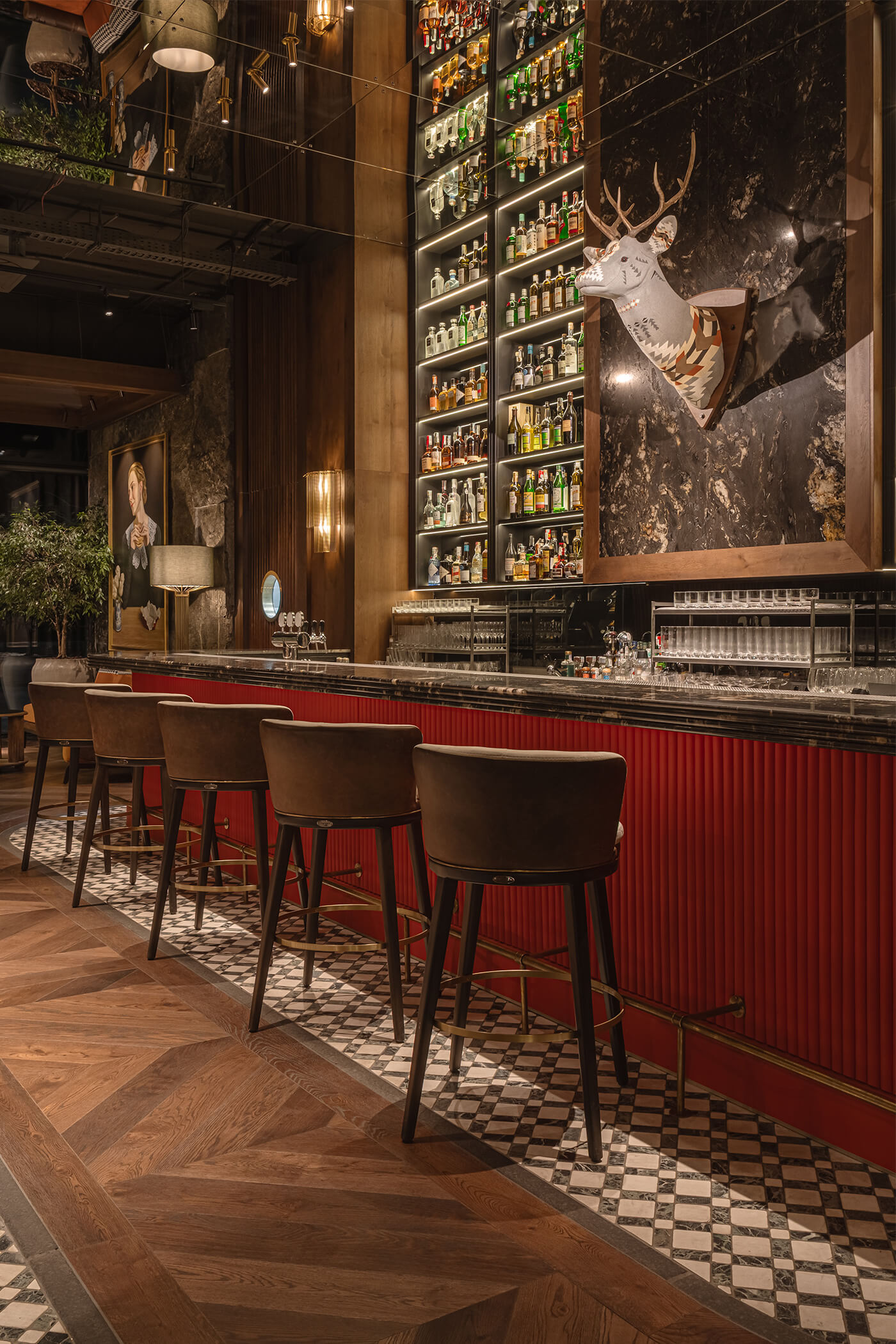
Особливу роль відіграє стеля, де поєднано три типи оздоблення.
У центрі залу — індустріальна стеля, яка надає простору сучасності та брутального характеру. По периметру вона контрастує з класичними дерев’яними кесонами — теплими, затишними й більш традиційними. Таке поєднання створює виразний візуальний контраст і додає простору пластики та зонування.
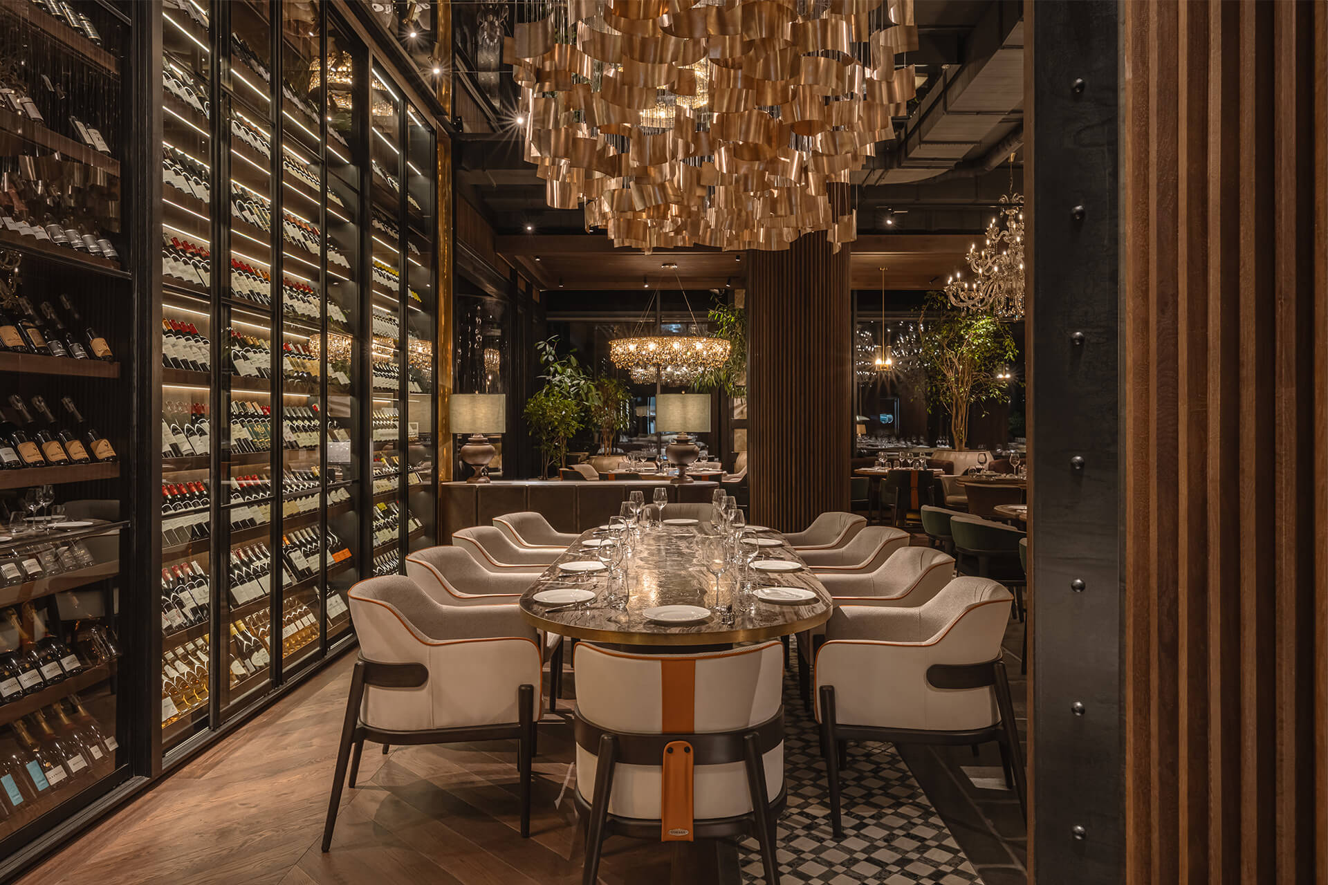
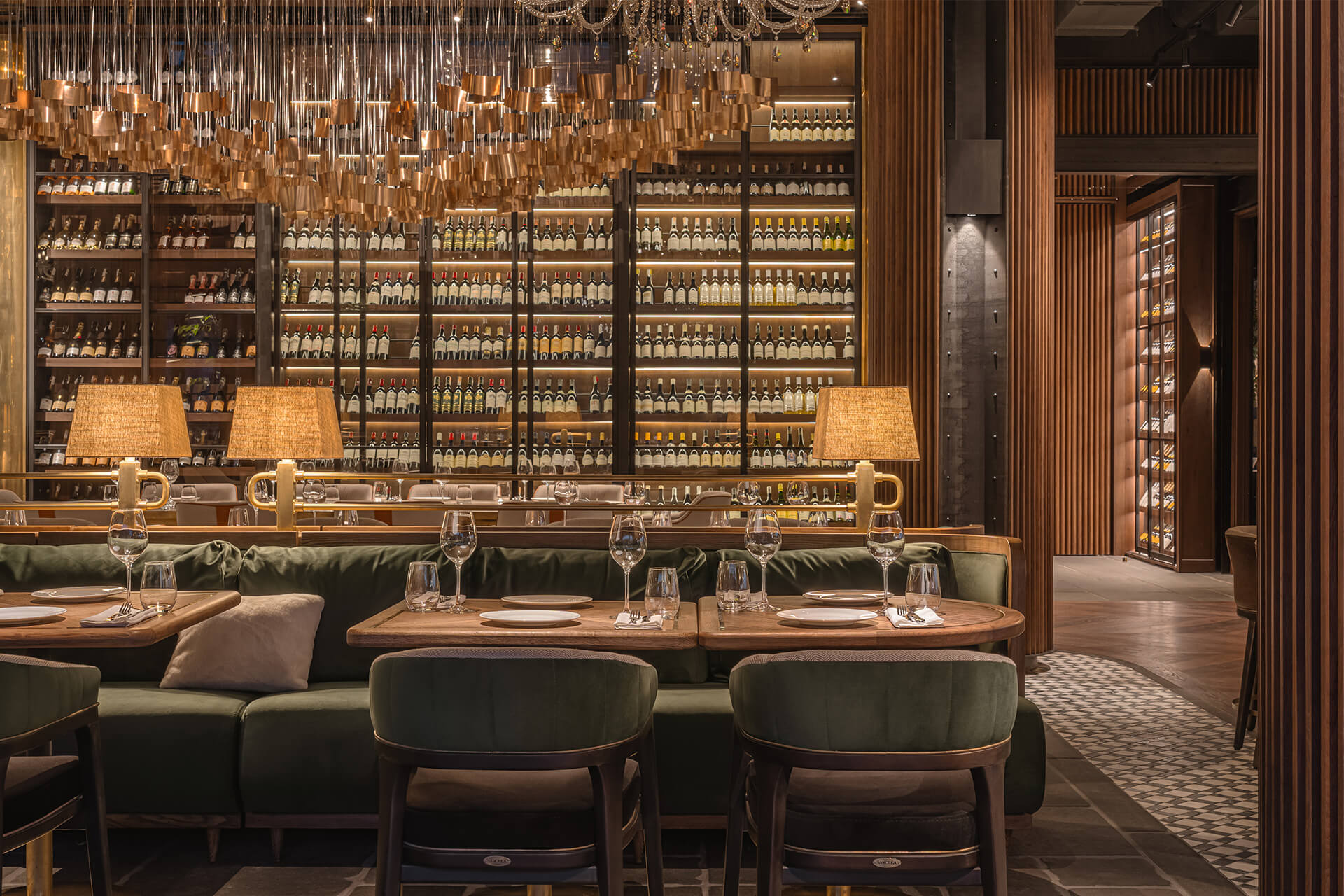
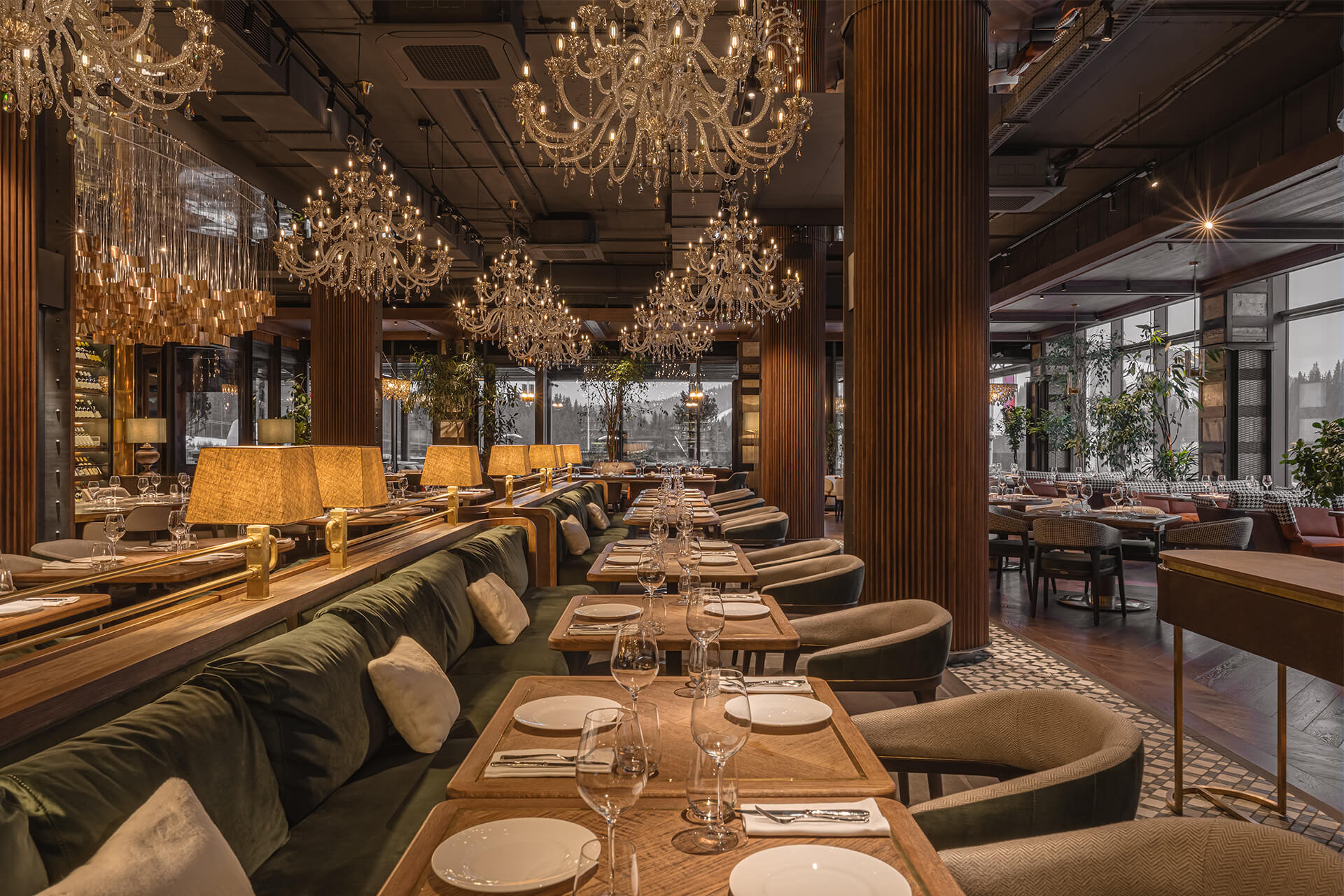
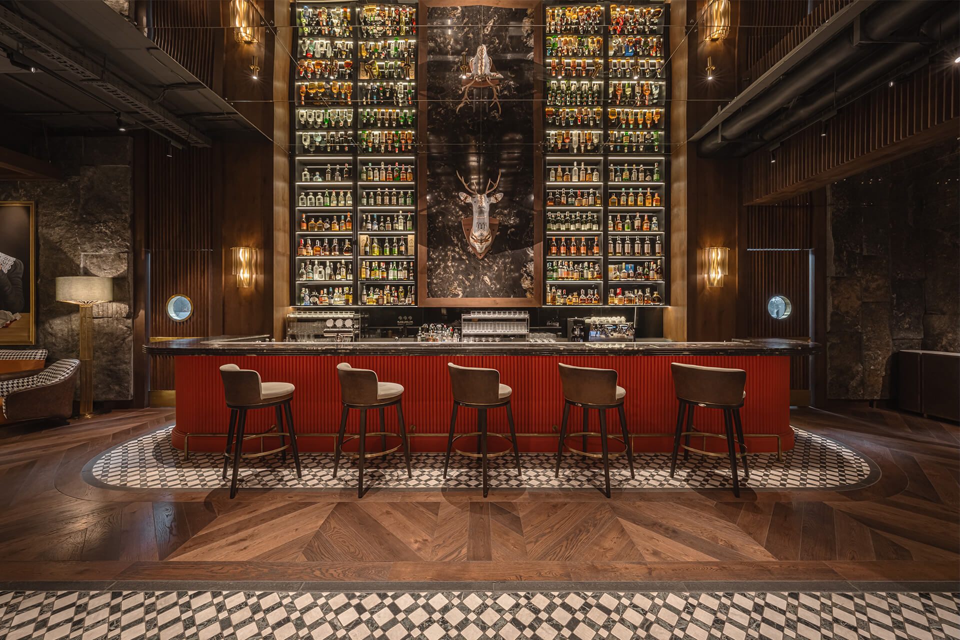
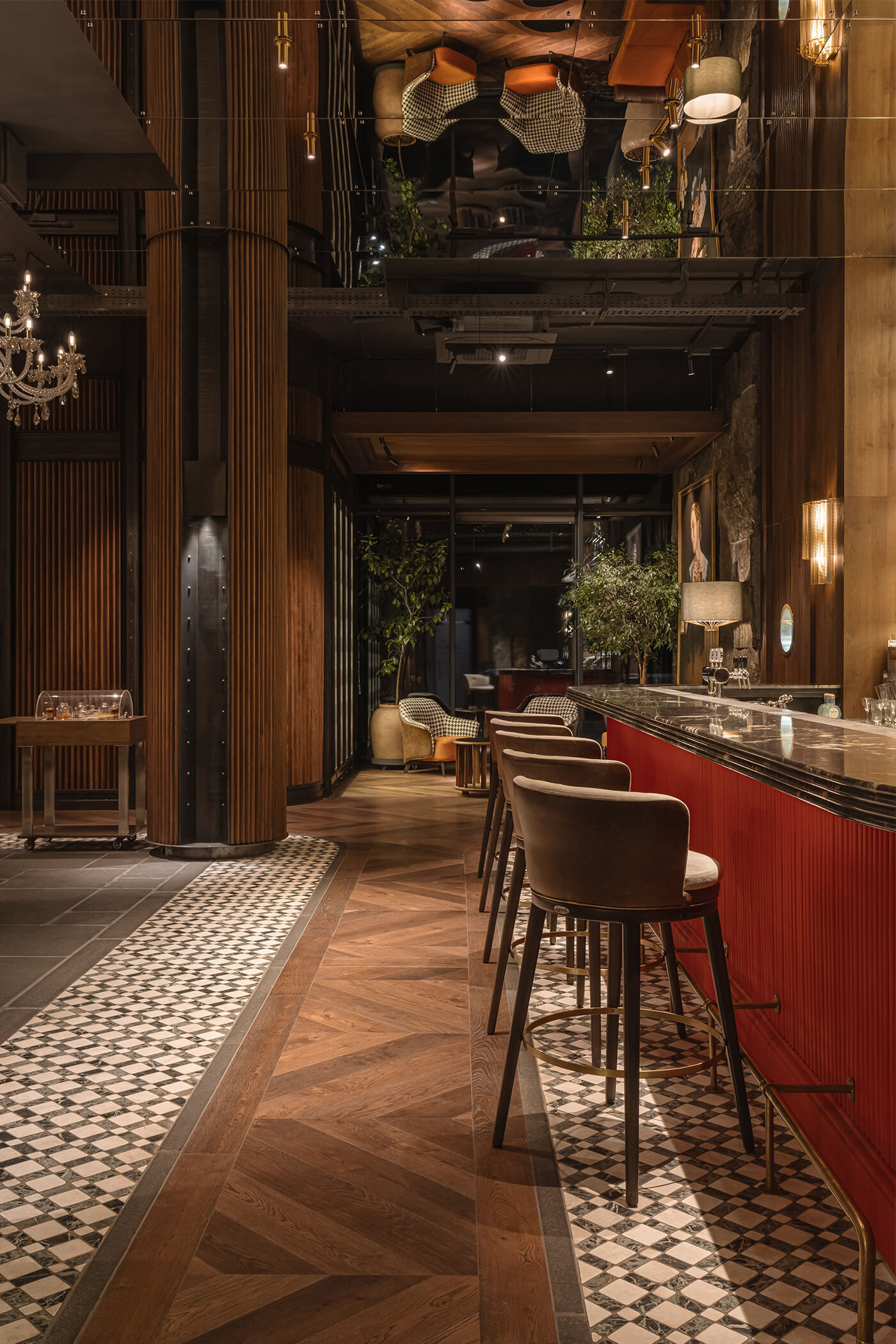
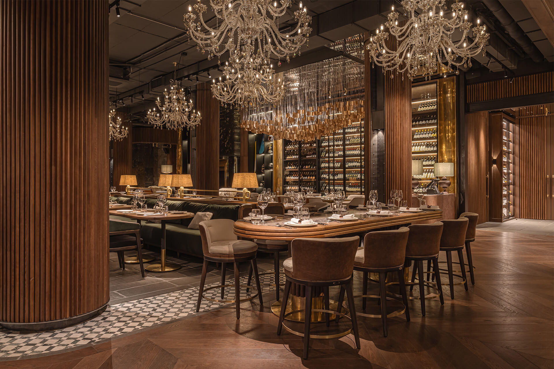
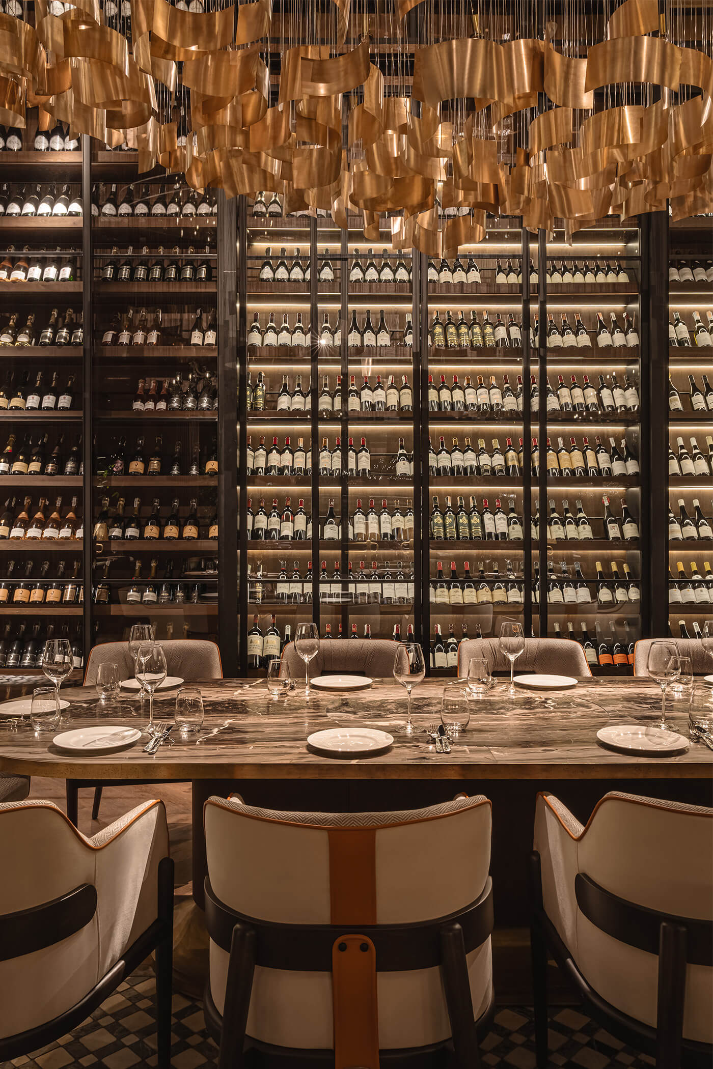
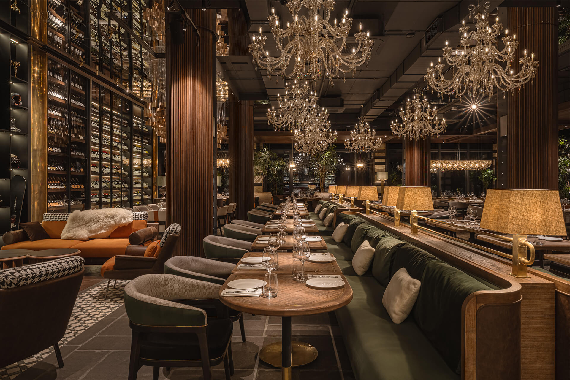
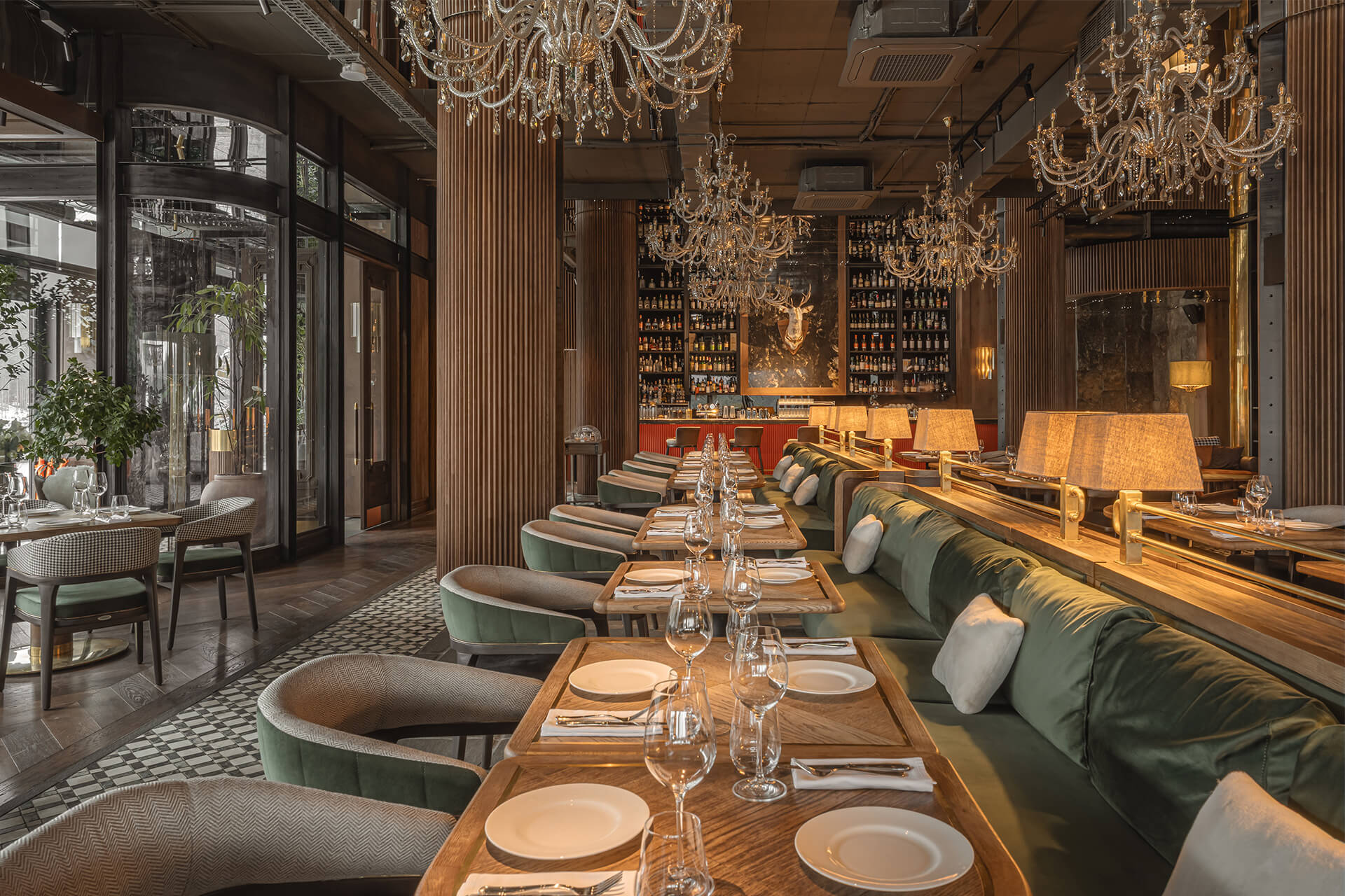
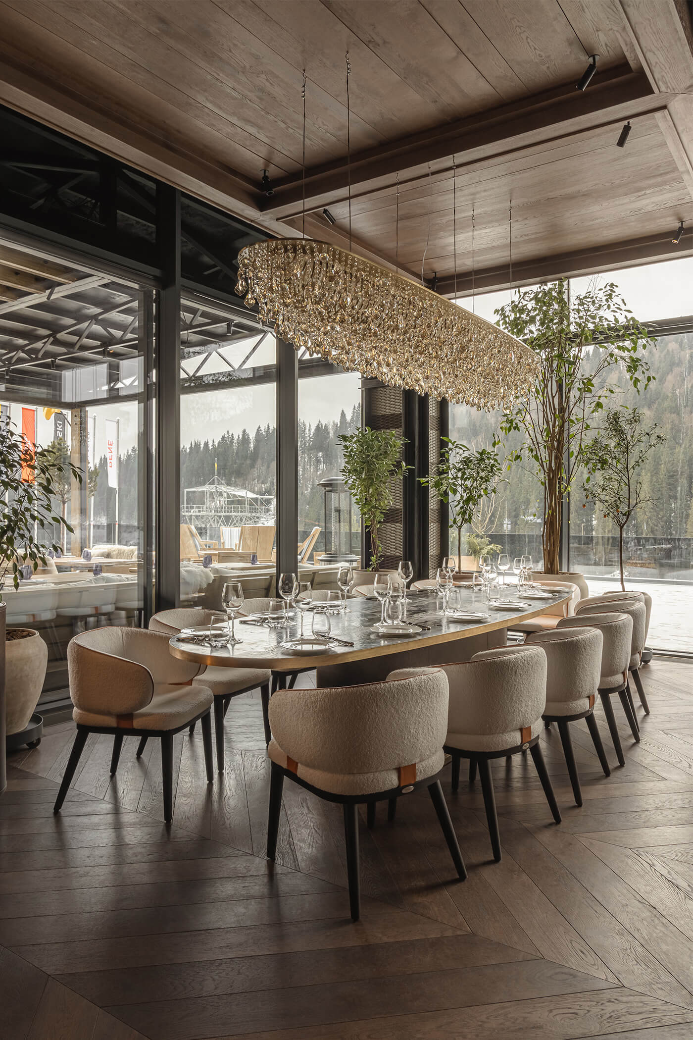
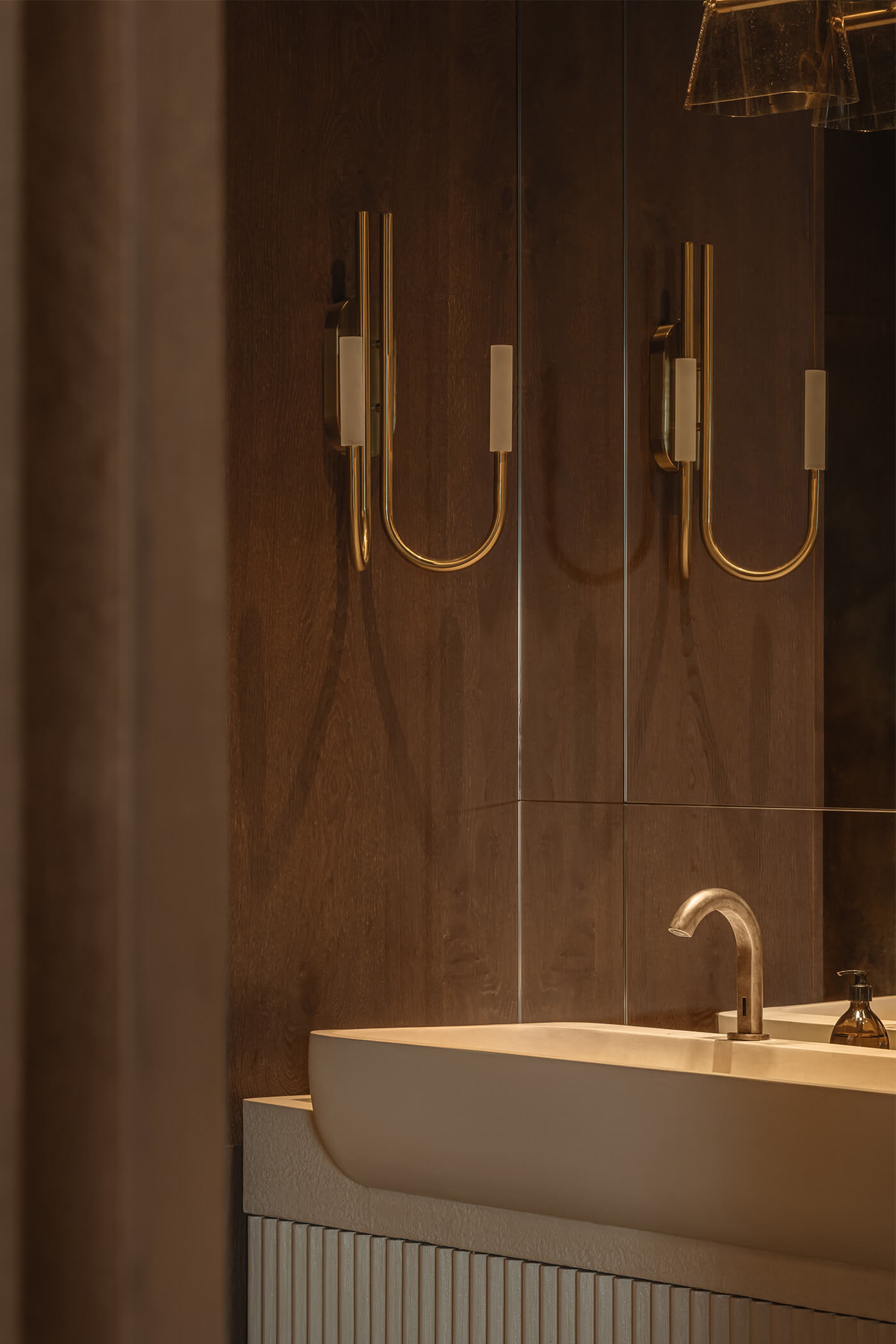
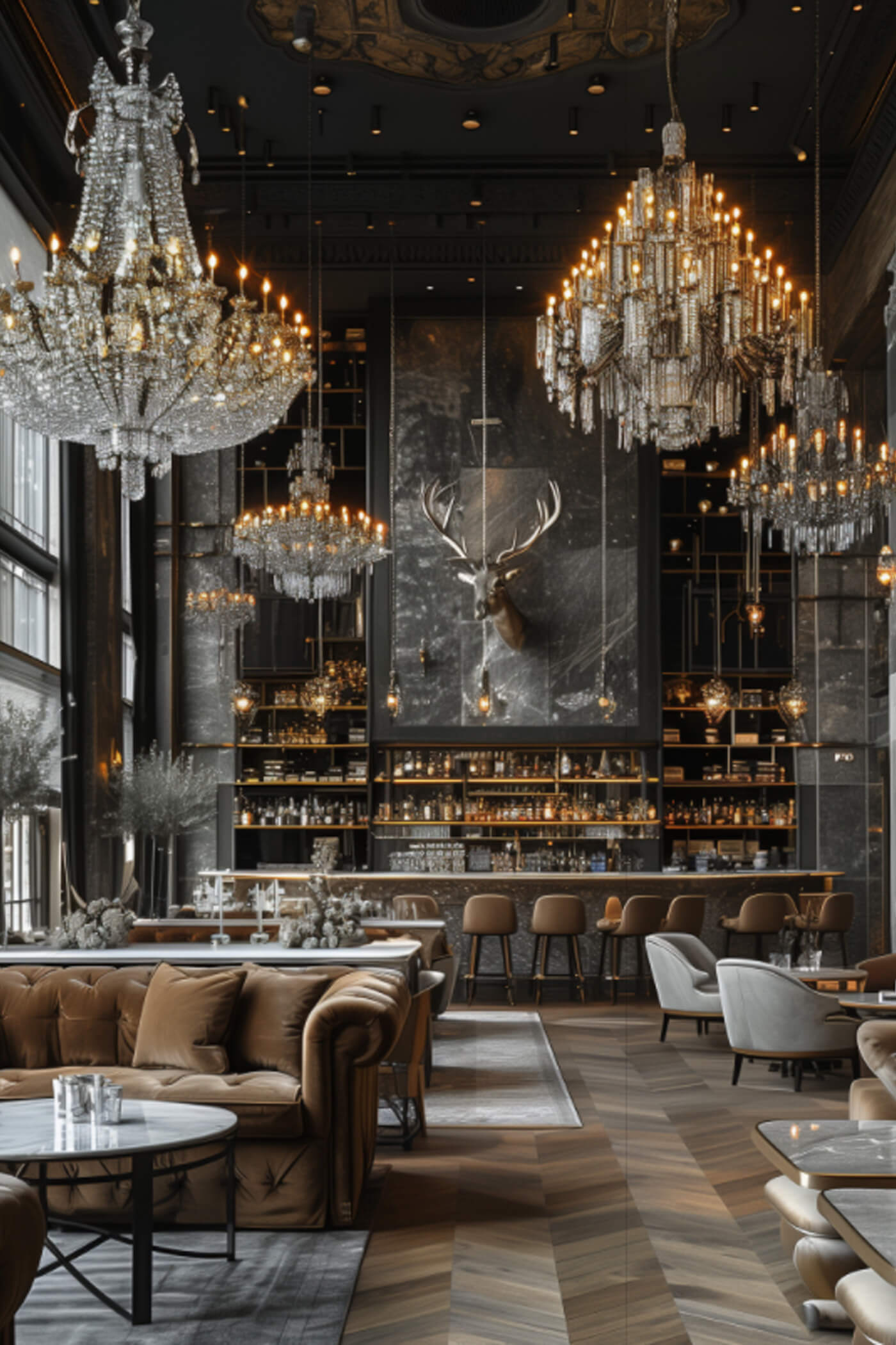
Над баром, каміном і ефектною винною шафою використано дзеркальну стелю. Вона створює відчуття двосвітного простору, візуально збільшує висоту полиць, каміна та винної шафи, надаючи їм масштабності й драматичності.
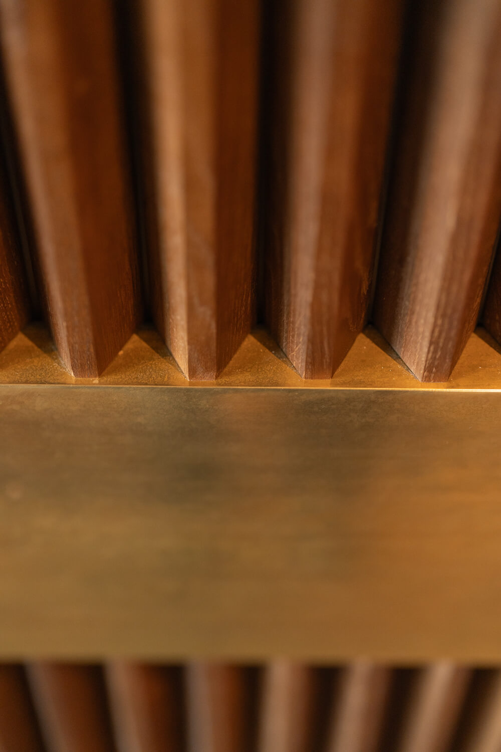
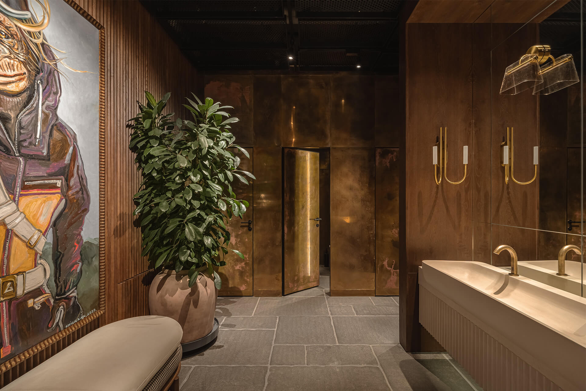
Оздоблення вхідних груп виконано нестандартно. У ресторані їх дві, і кожна має виразний архітектурний характер. Натхненням слугували вітрини паризьких магазинів із членуванням фасаду, класичними пропорціями та м’якими заокругленнями кутів. Водночас ці елементи реалізовані в характерній для інтер’єру брутальній манері — через використання чорного вороненого металу та грубих, рельєфних дерев’яних панелей.
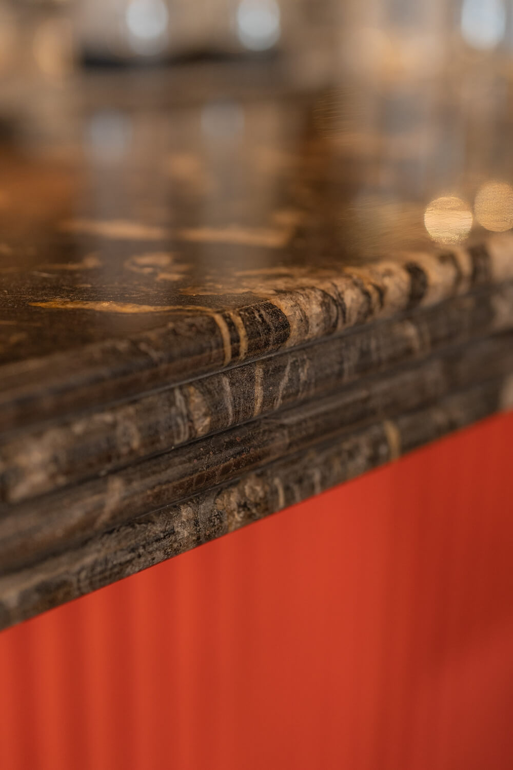
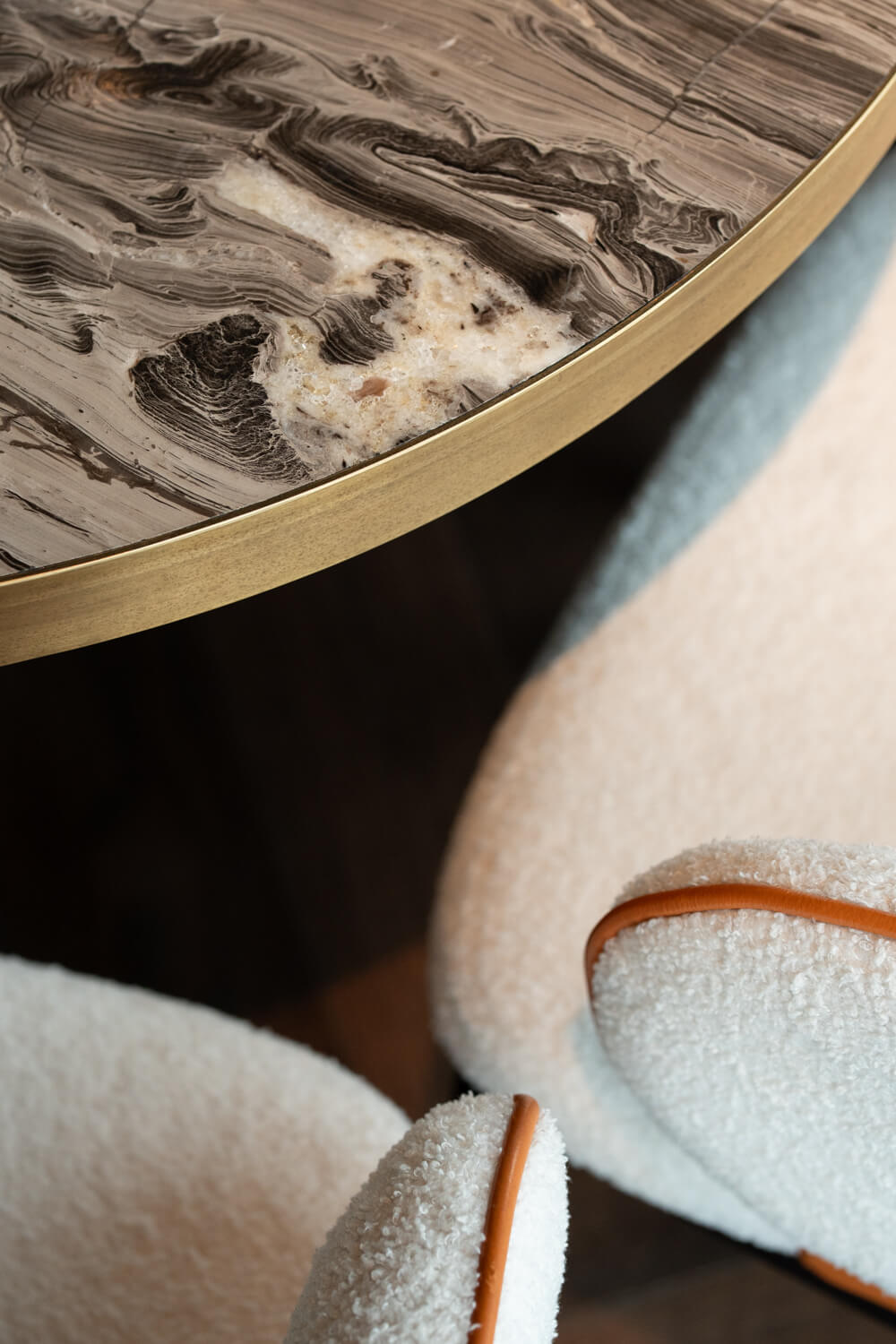
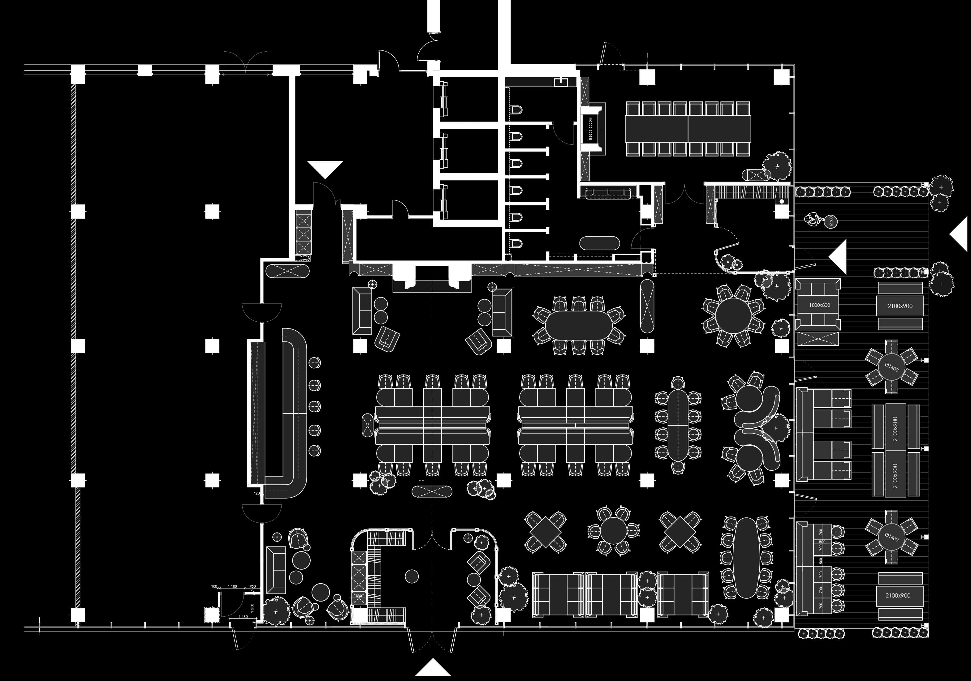
Підлога також побудована на складному поєднанні матеріалів. Тут використано три типи оздоблення: грубий паркет у стилі гірського шале, чорний природний камінь та декоративну мозаїку, яка додає нотку розкоші. Усі елементи зібрані в єдину композицію навколо центральних колон залу.
Колони в інтер’єрі мають різне стилістичне вирішення.
Центральні колони — округлі, з неокласичними рисами, доповнені брутальним акцентом у вигляді вбудованих бра з вороненого металу. Колони по периметру залишені бетонними та взяті в металеву обійму; їх форма відсилає до архітектури старовинних паризьких вокзалів.
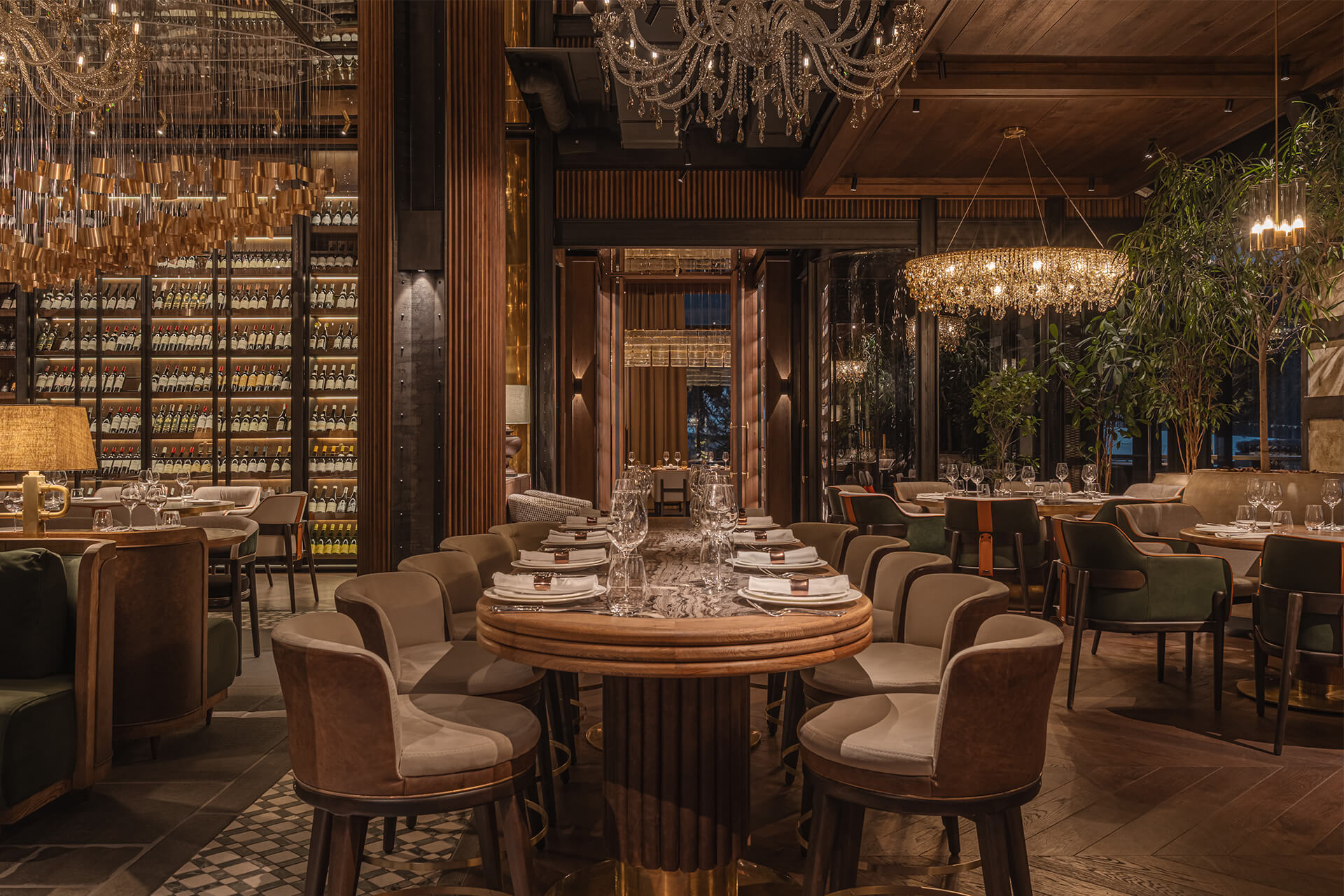
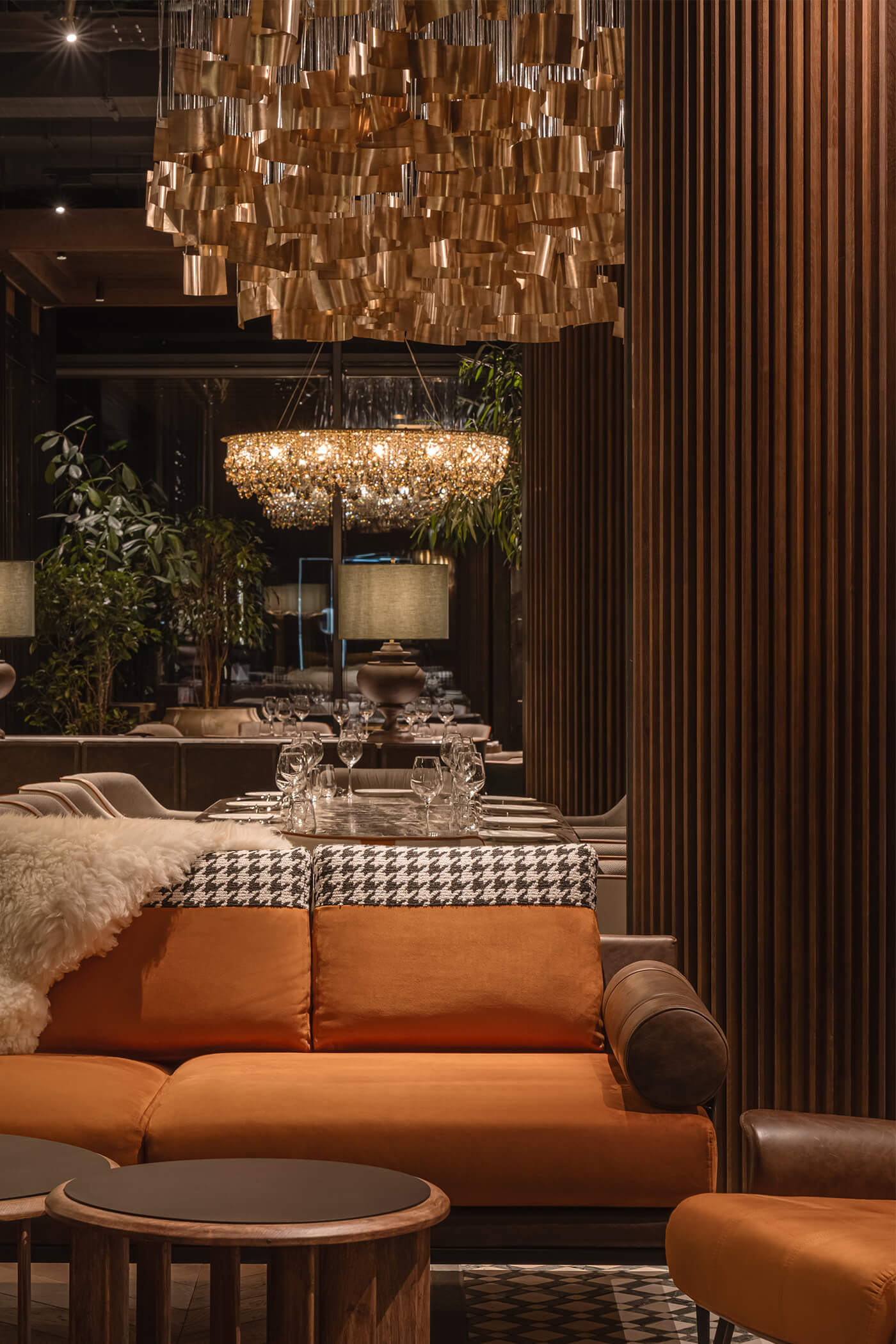
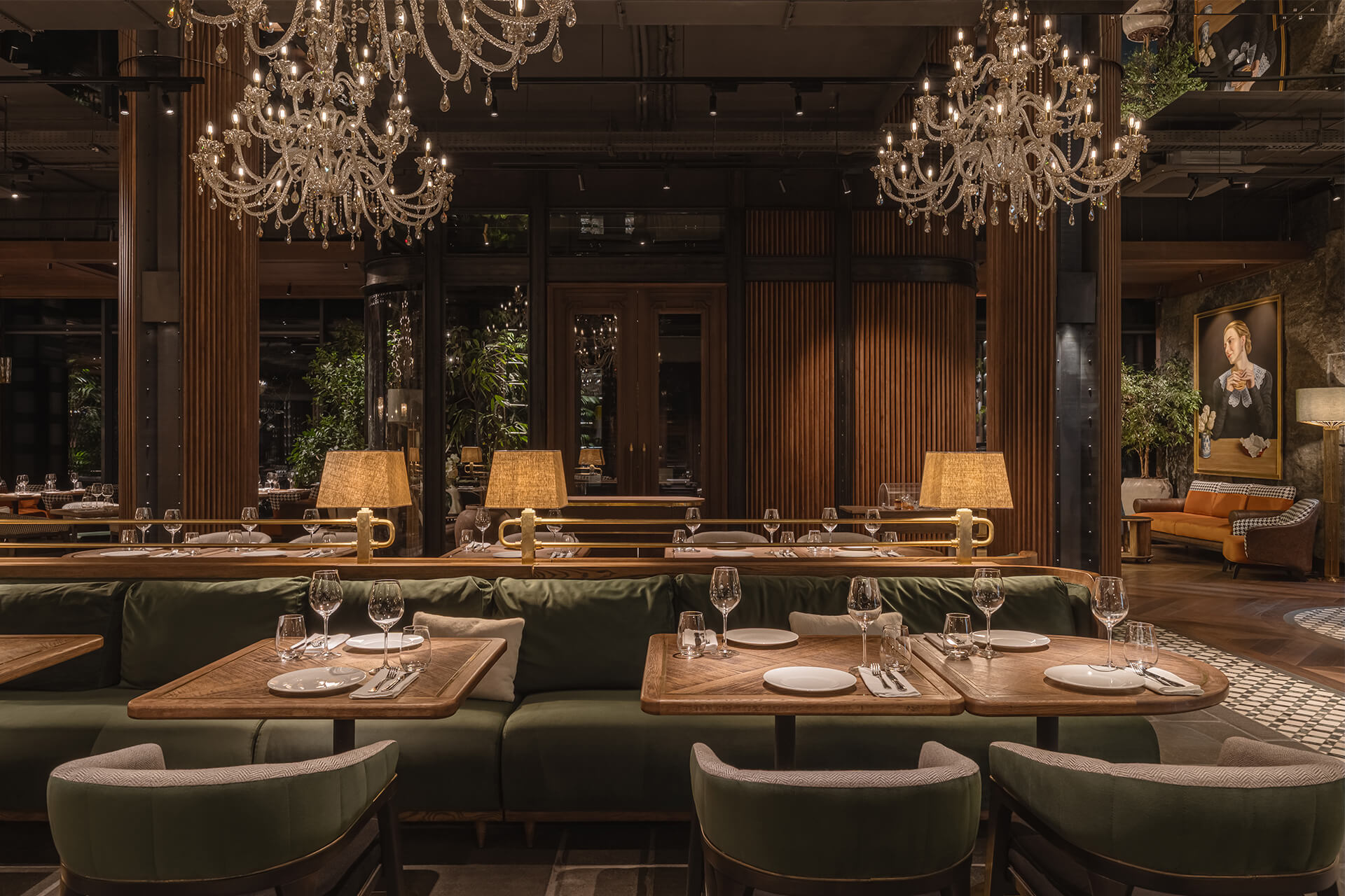
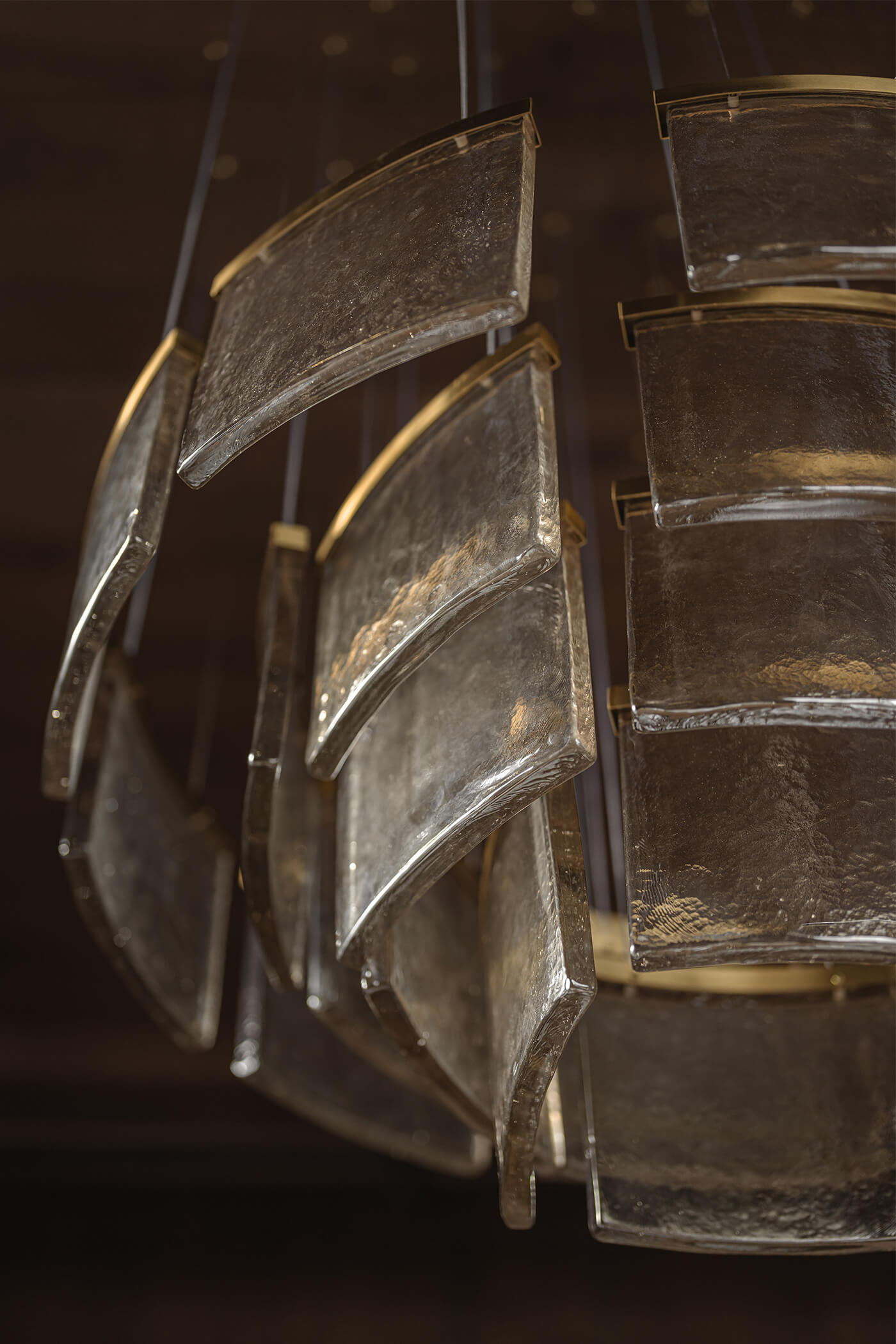
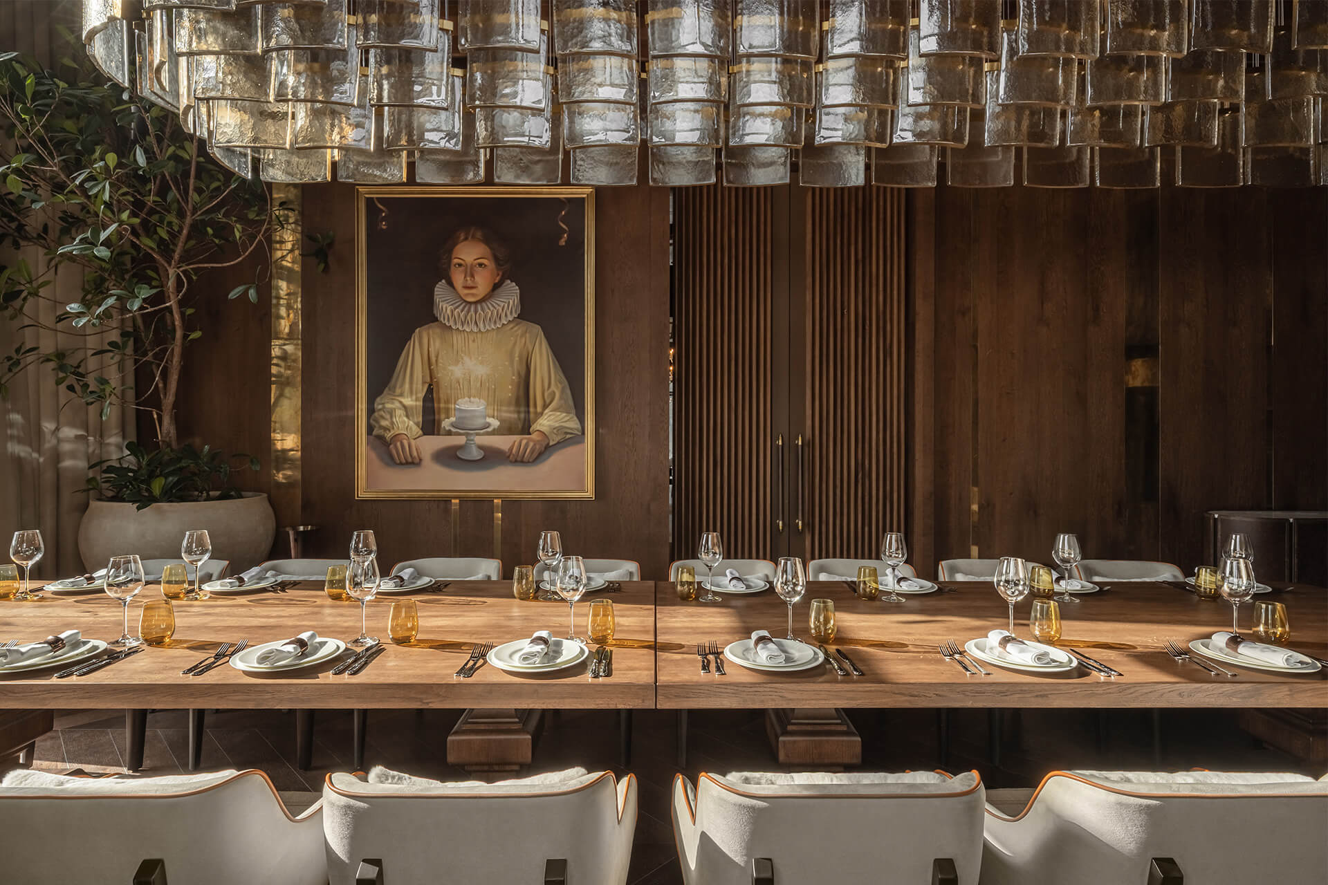
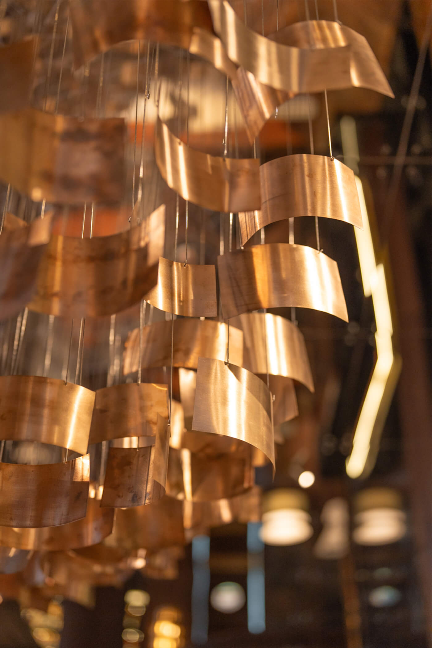
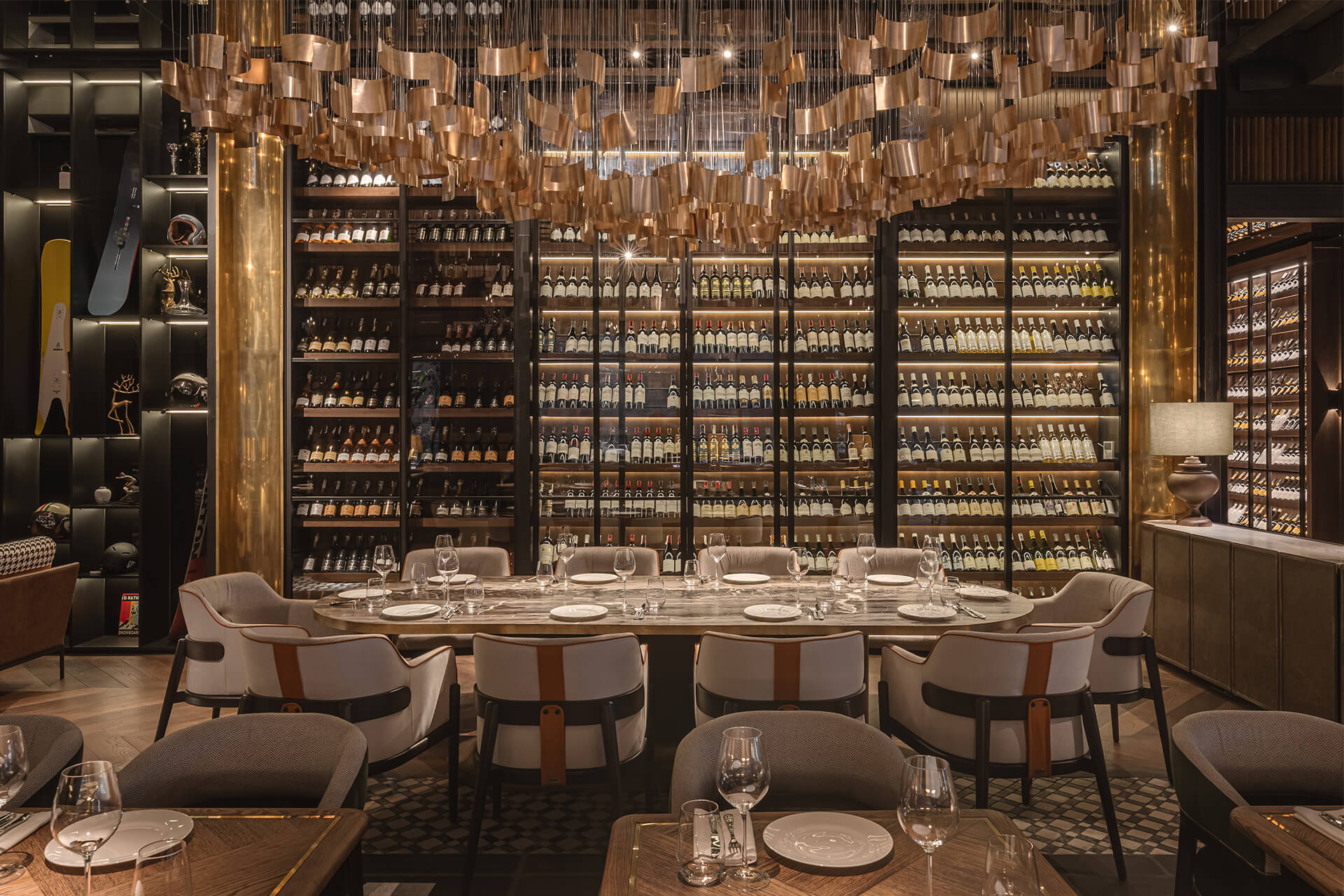
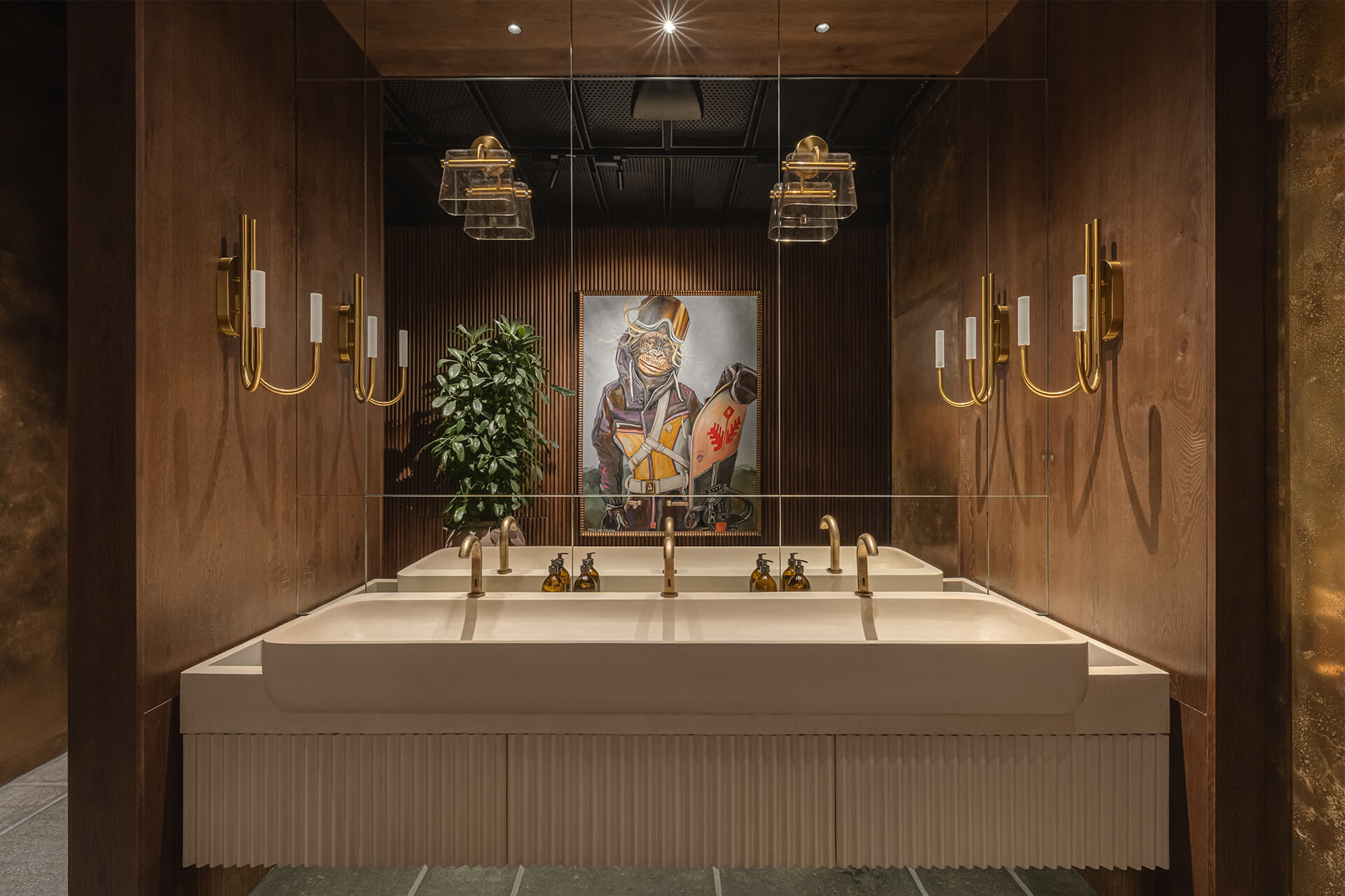
Усе освітлення розроблялося індивідуально та на замовлення. Класичні люстри в центрі залу та сучасні хрустальні люстри по периметру підкреслюють розкіш простору на тлі грубих матеріалів. Біля винної шафи розміщена велика кастомна мідна люстра сучасної форми, що стає акцентом зони.
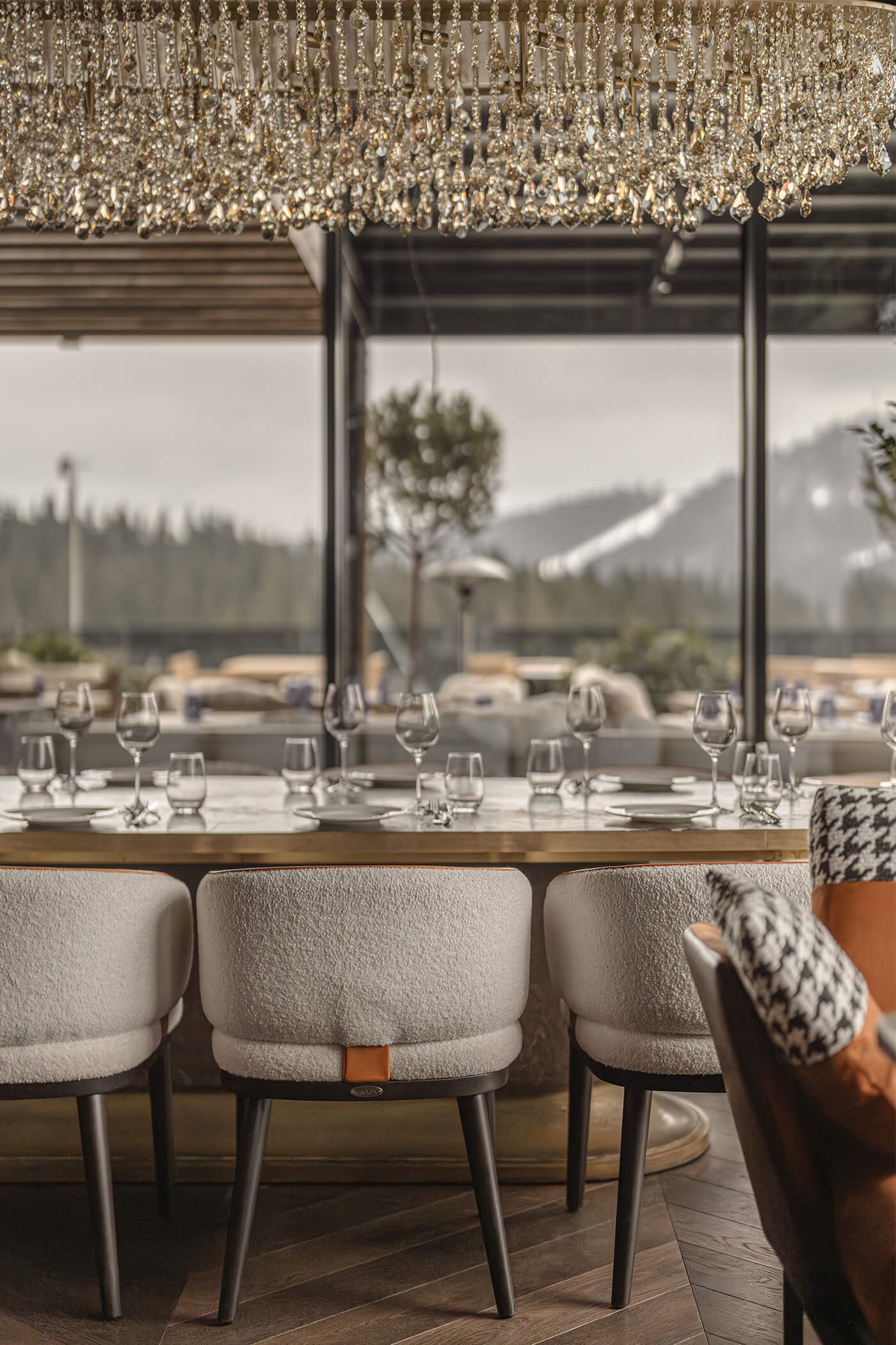
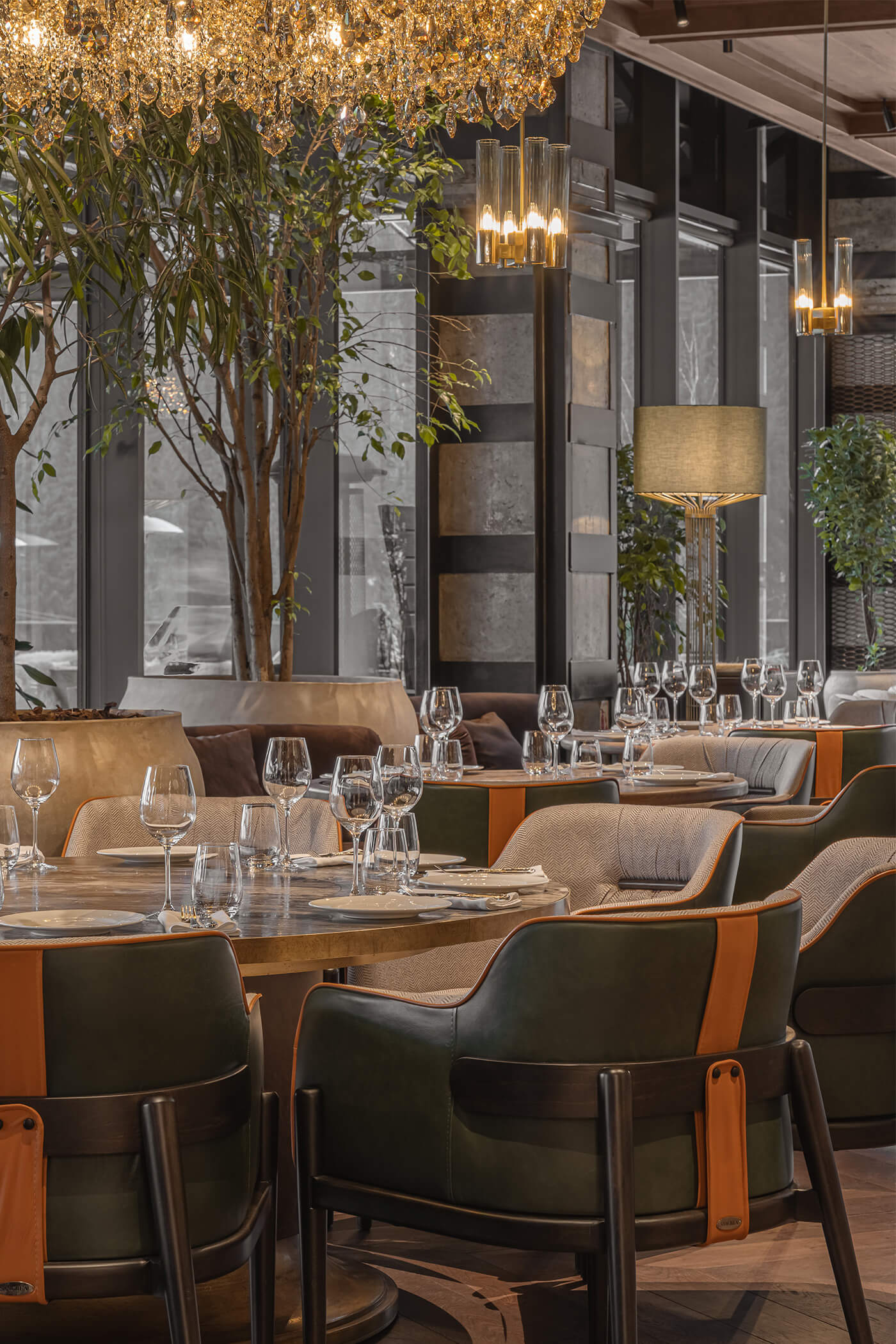
Особливу увагу було приділено меблям. Кожен стілець і диван детально опрацьовані та мають індивідуальне оздоблення. У кожному елементі поєднано кілька матеріалів, щоб створити складний, глибокий і виразний образ.
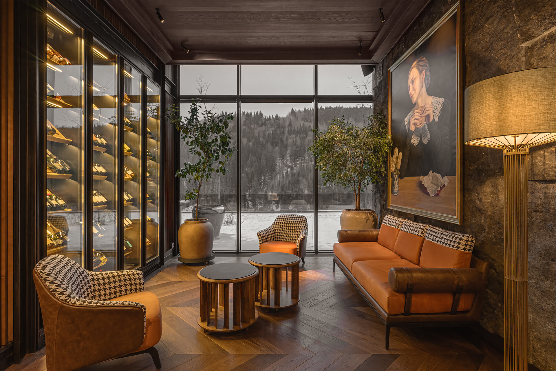
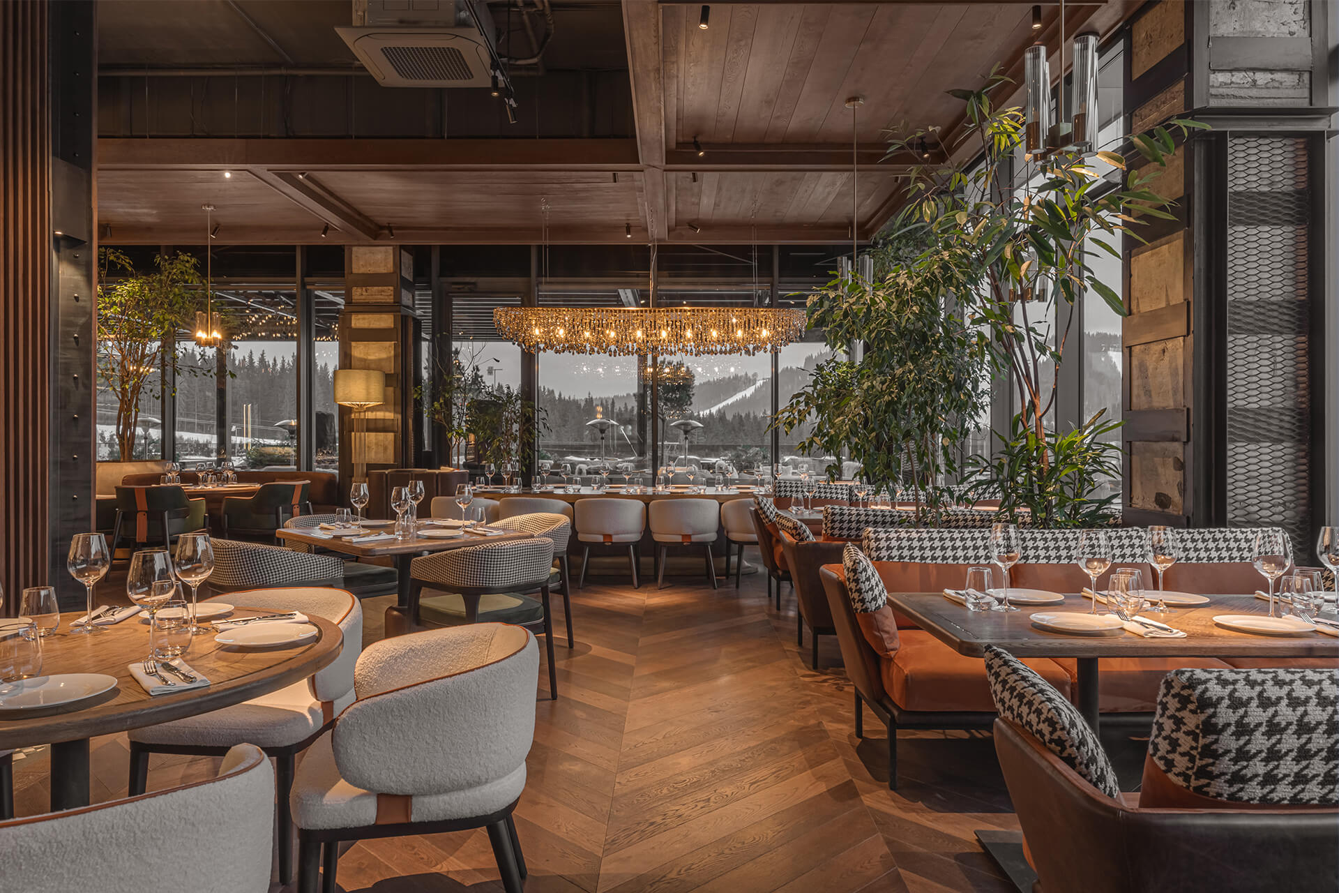
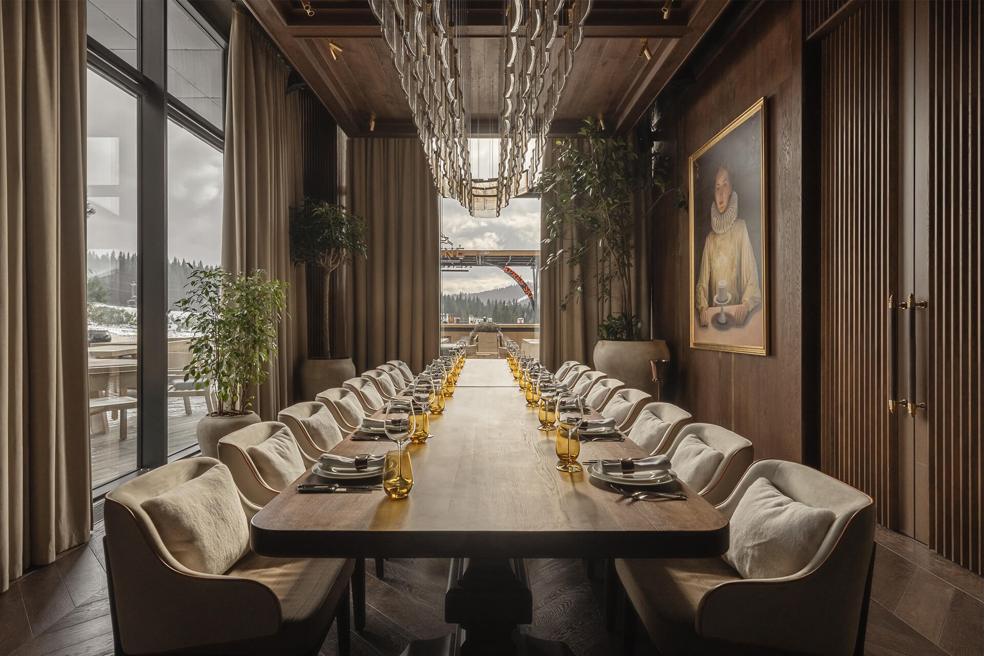
Банкетна кімната — окремий, самодостатній простір із власним каміном, що надає їй особливої затишності та водночас урочистості. Вона простора, наповнена світлом завдяки великій кількості вікон і доповнена ефектною кастомною скляною люстрою, яка підкреслює її статусність.
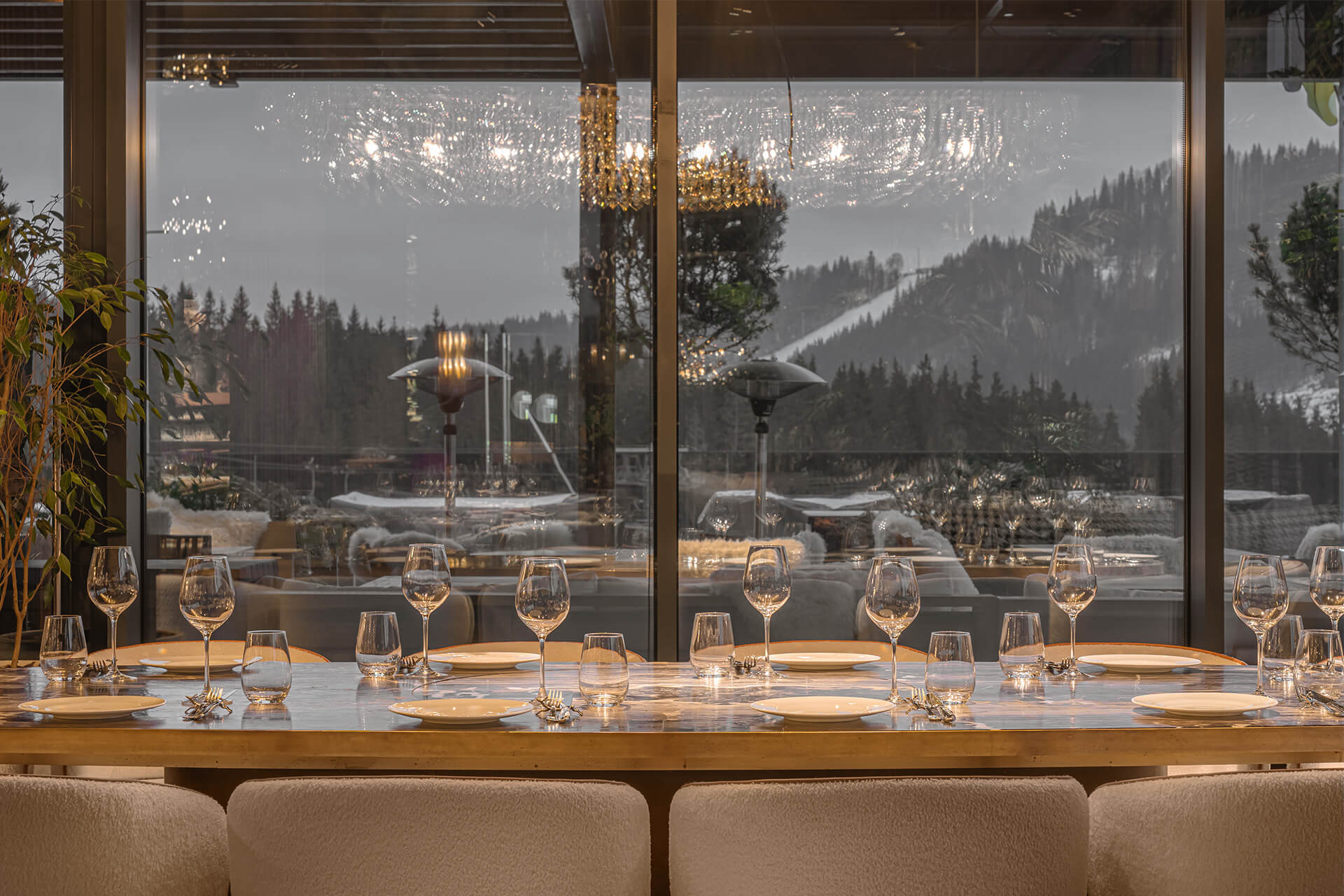
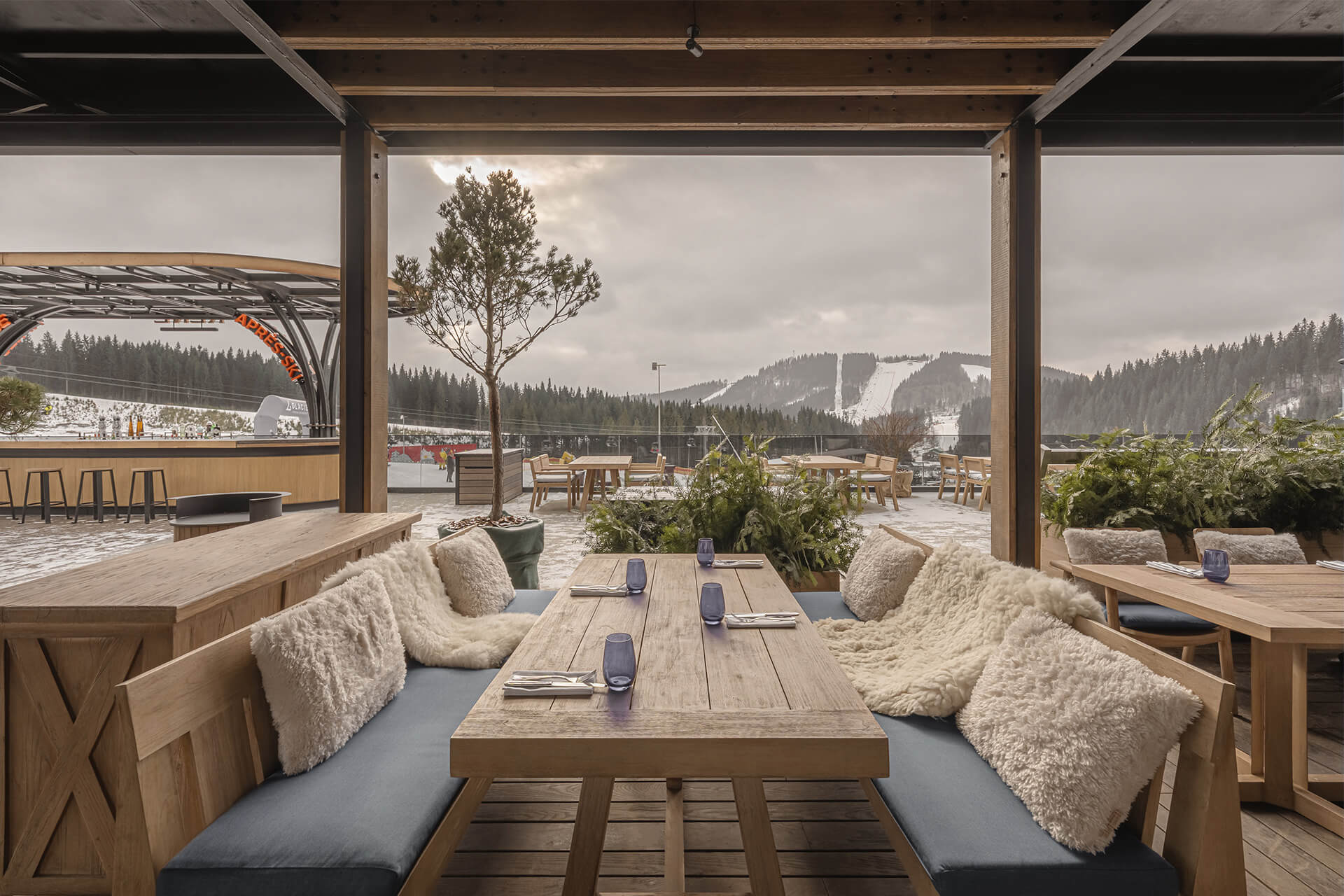
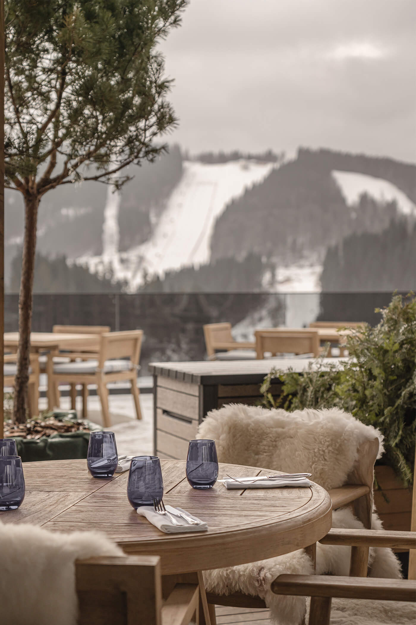
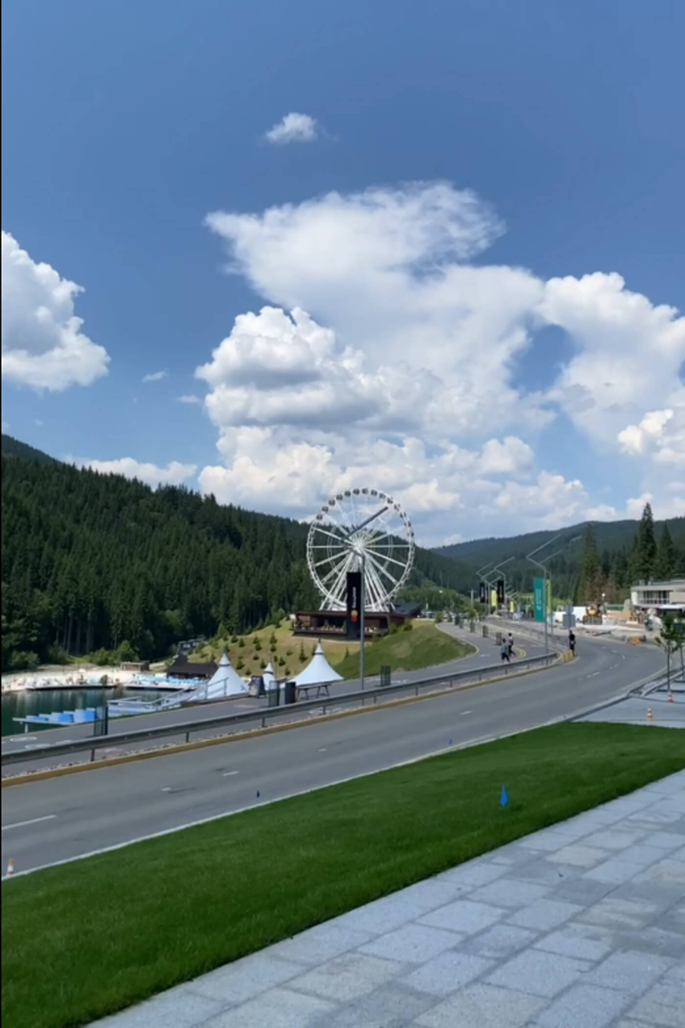
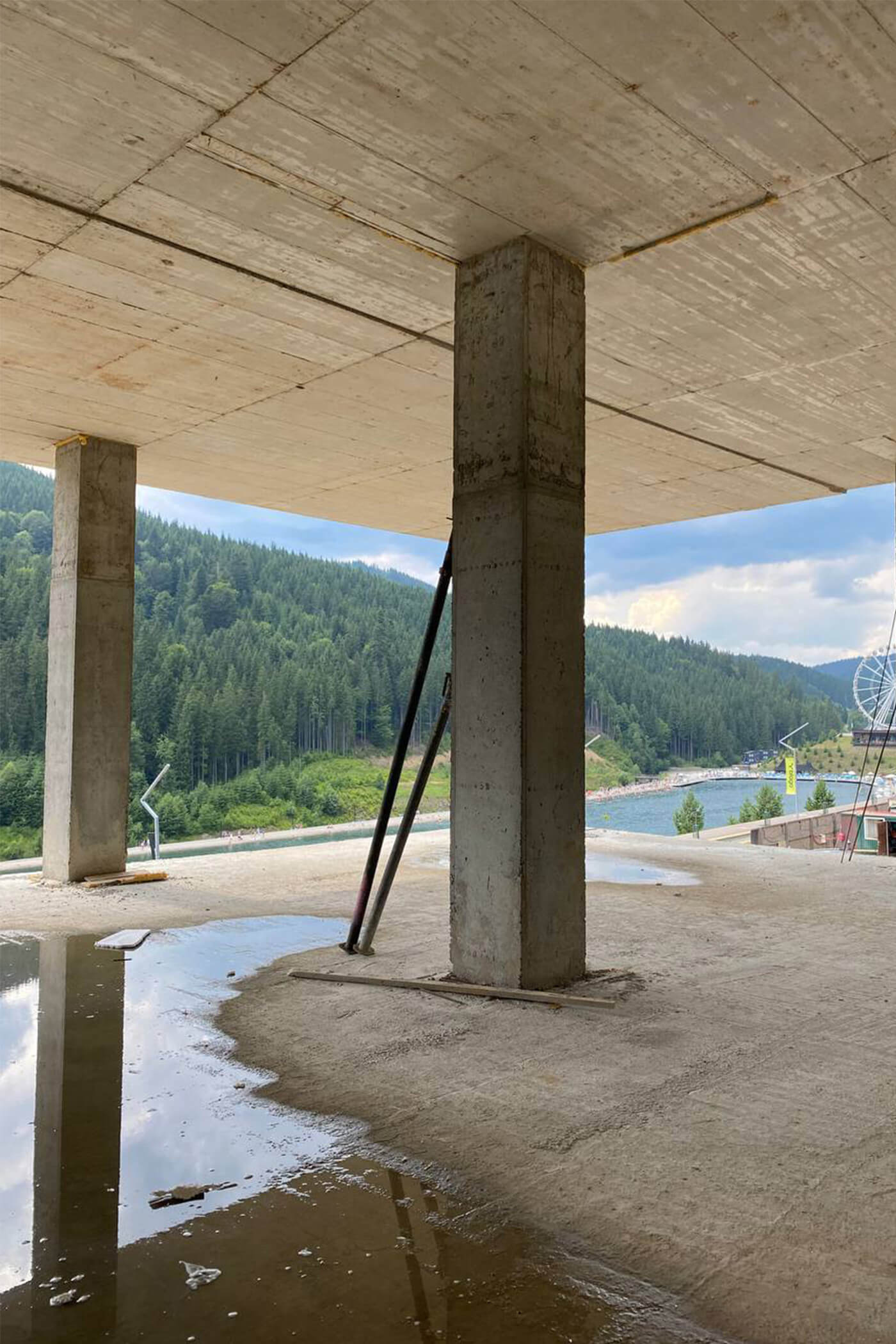
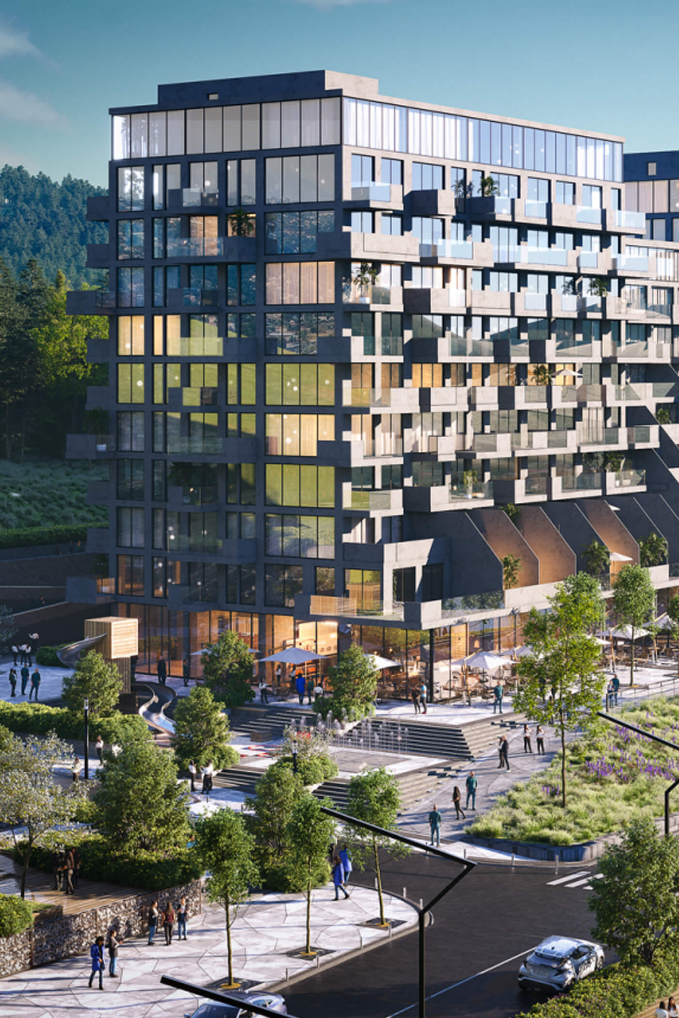
RENÉ вибудовує щирий діалог із карпатським ландшафтом. Великі панорамні вікна стирають межу між інтер’єром і навколишніми гірськими краєвидами, інтегруючи природу в досвід гостей та роблячи її невід’ємною частиною відвідування ресторану.
У проєкті використано локальні матеріали, зокрема дерево та камінь, а багато індивідуально виготовлених елементів оздоблення та деталей були створені місцевими майстрами. Такий підхід дозволив сформувати простір, глибоко пов’язаний зі своїм оточенням і багатими ремісничими традиціями регіону.
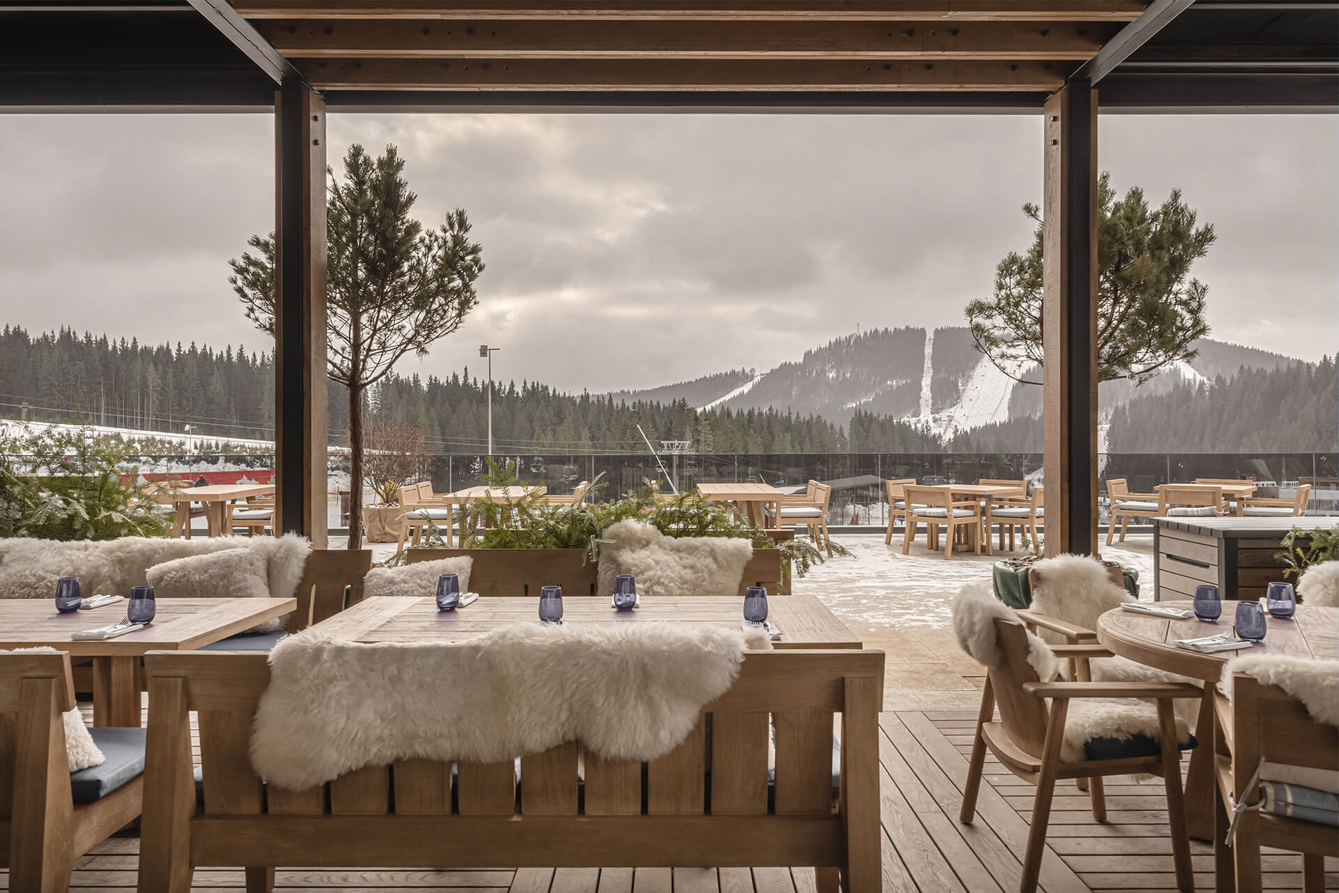
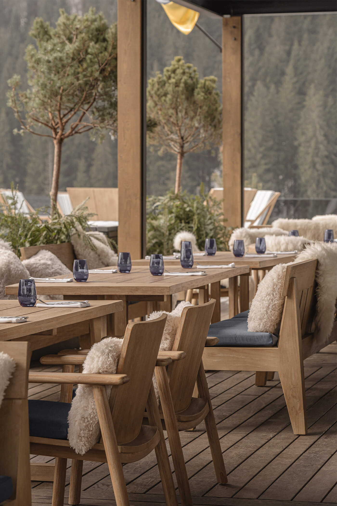
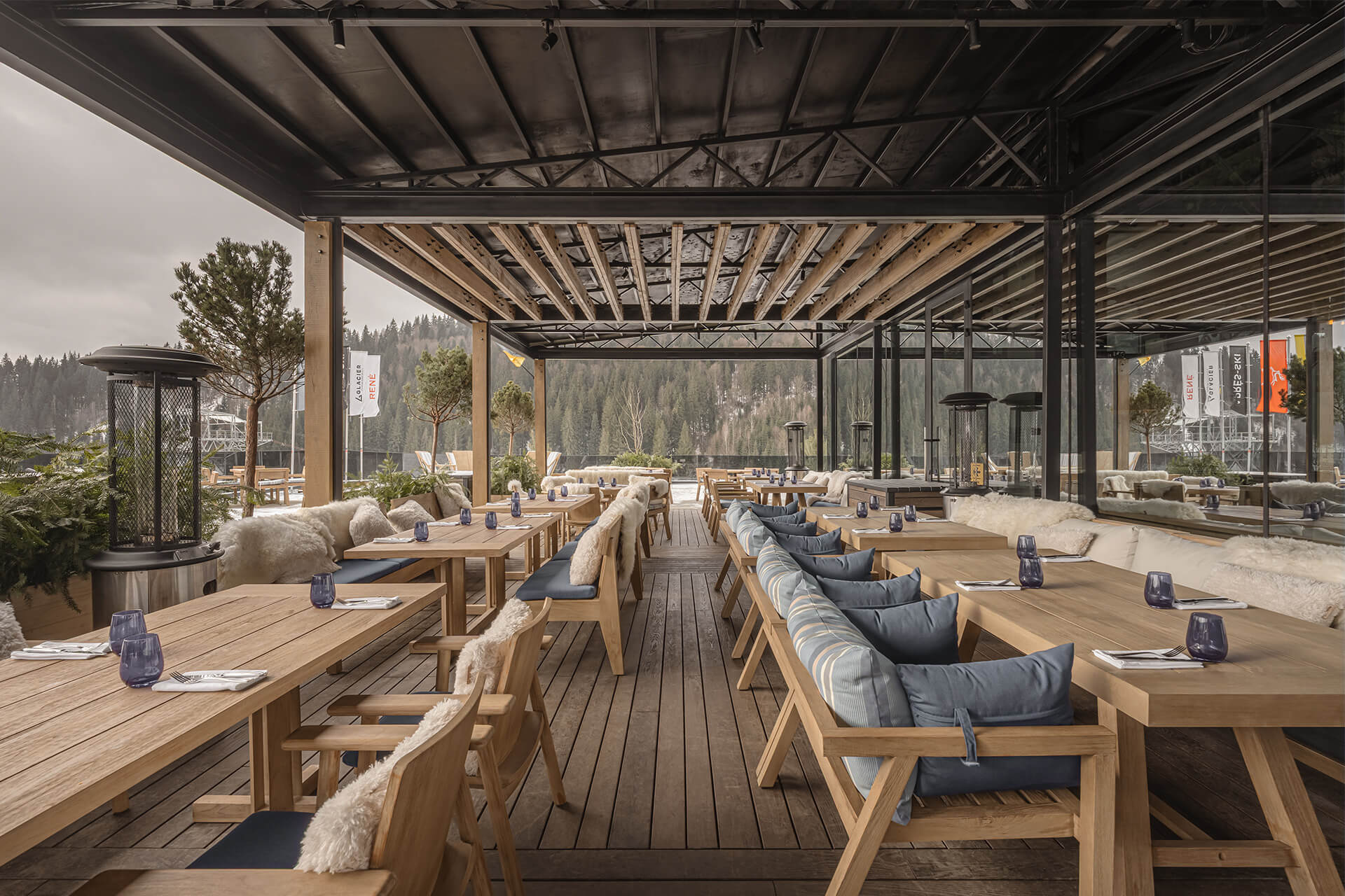
Для покращення доступності та зручності різних сценаріїв відвідування ресторан має два входи. Перший виходить на головну набережну-променад уздовж озера, тоді як другий безпосередньо сполучений із гірськолижним схилом. Завдяки цьому лижники можуть потрапити до ресторану просто зі спуску, опинившись на просторій відкритій терасі.
Відкрита та криті тераси, спроєктовані для використання як у літній, так і в зимовий сезон, відкривають панорамні види на навколишні гори. Вони є природним продовженням ресторану, створюючи простір для зустрічей, відпочинку та спілкування. Узимку гості можуть зігрітися біля вогнища після дня, проведеного на схилах, а в теплу пору року — насолоджуватися краєвидами та атмосферою курорту просто неба.
О проекте в цифрах
Step-by-step process that ensures flawless results

01.Workshop:
Проєкт RENÉ: як перетворити складні планувальні виклики на переваги
Робота над будь-яким проєктом починається з глибокого аналізу. Ми збираємо та вивчаємо всі фактори — від ландшафту до сценаріїв руху гостей, — які згодом стають основою планувальної концепції.
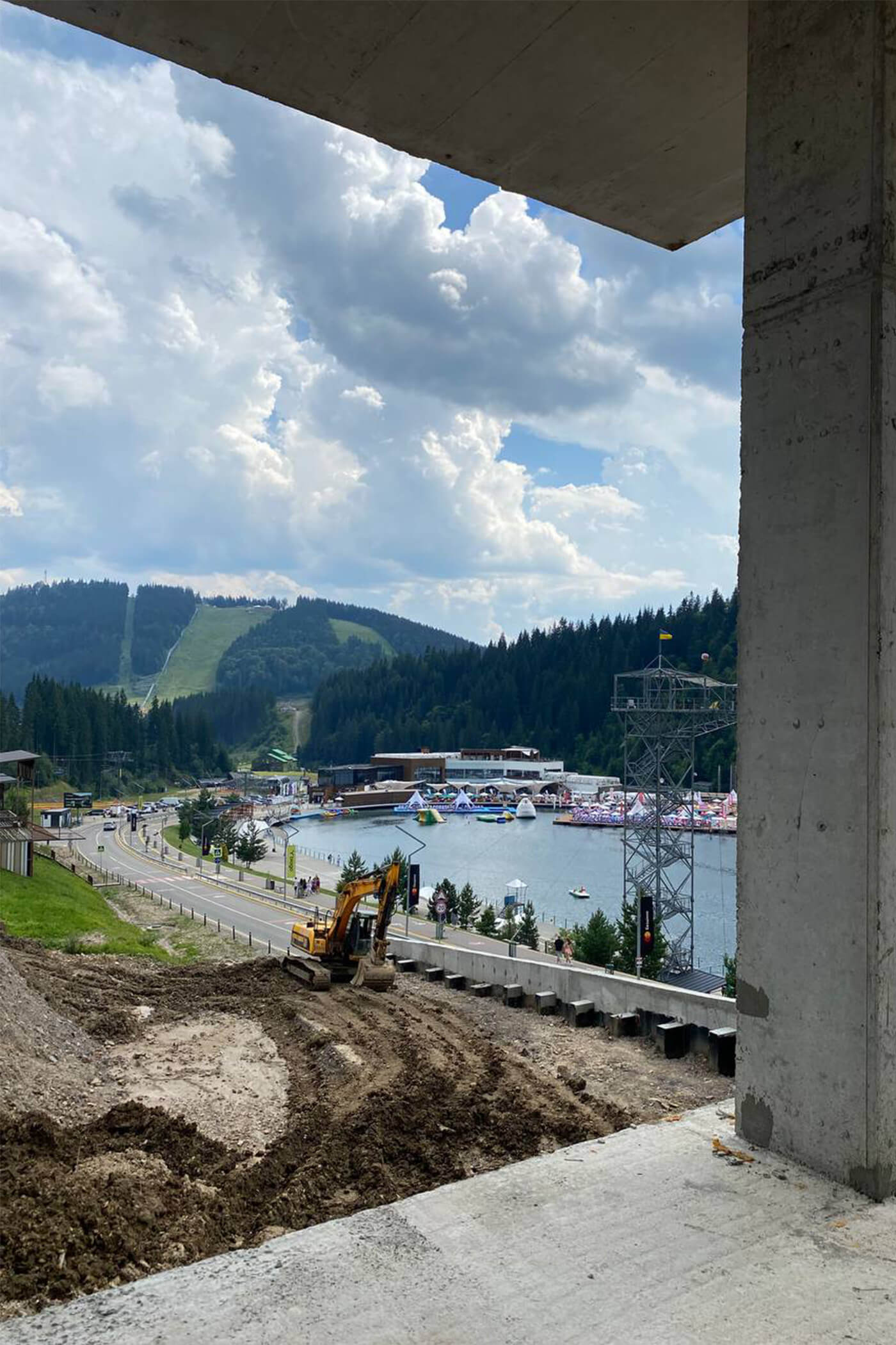
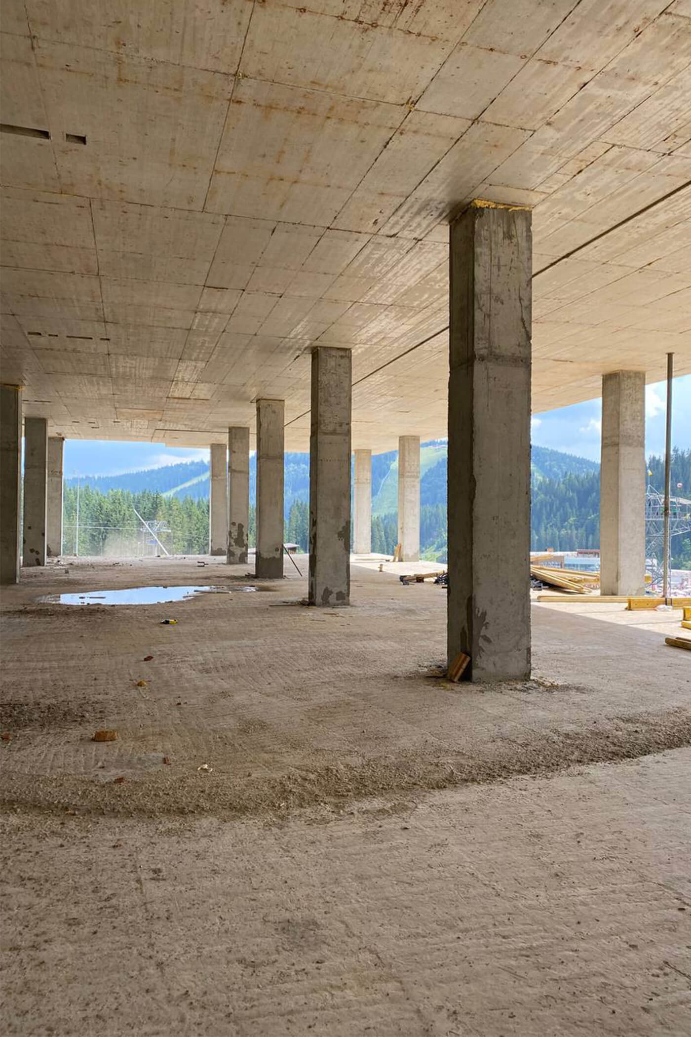
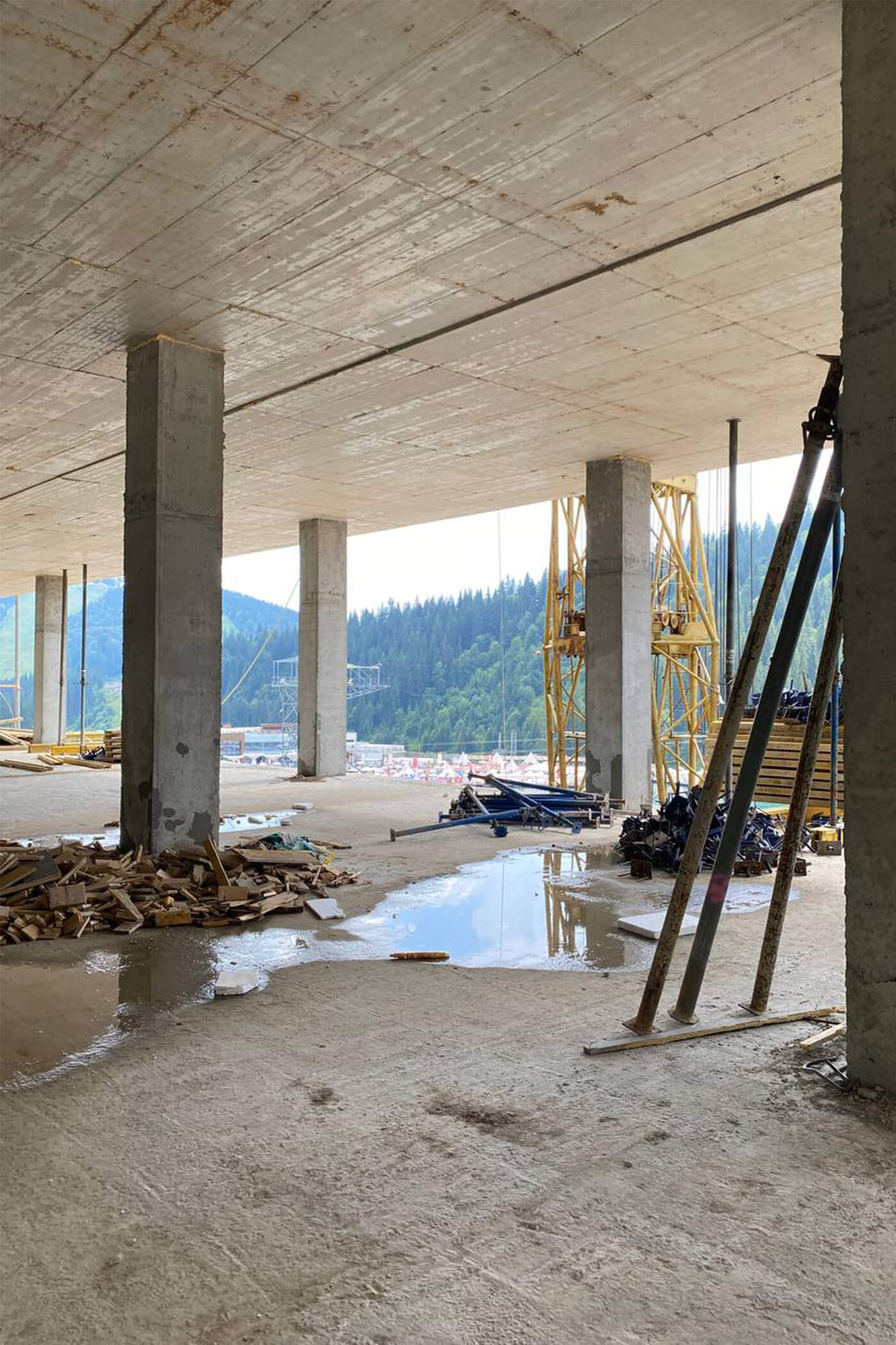
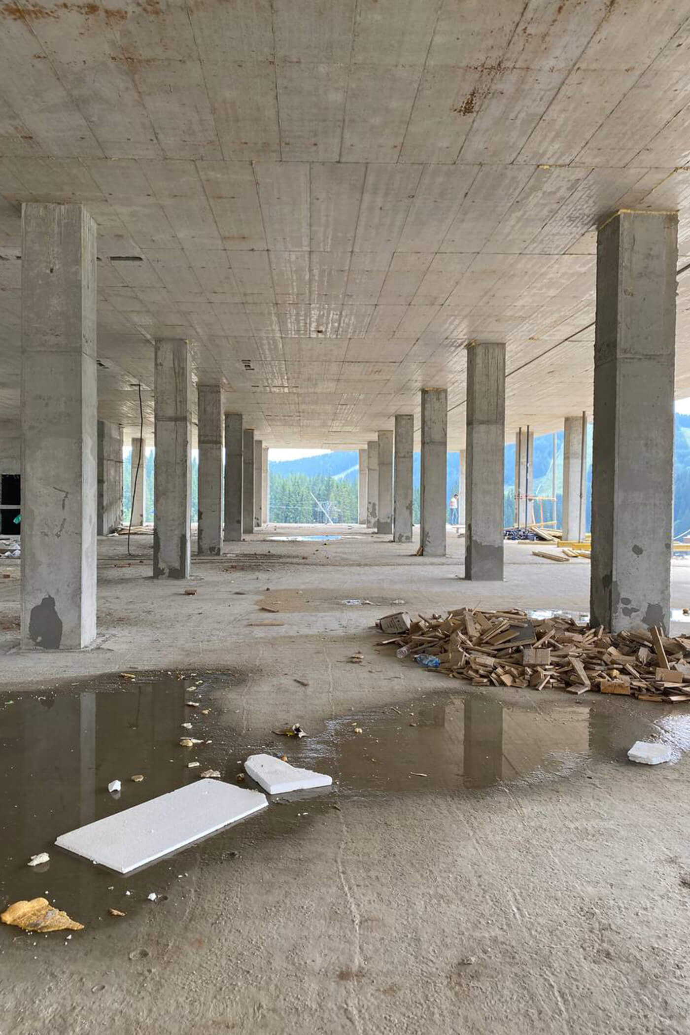
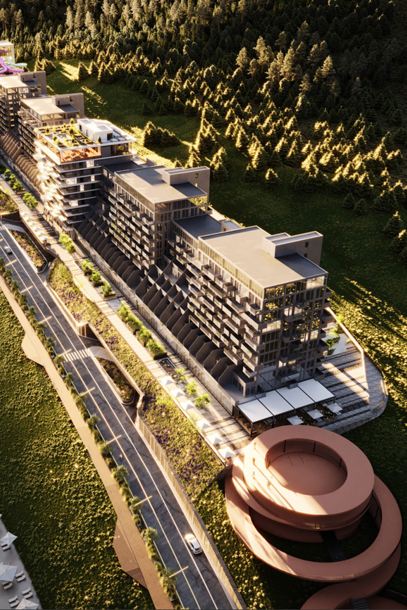
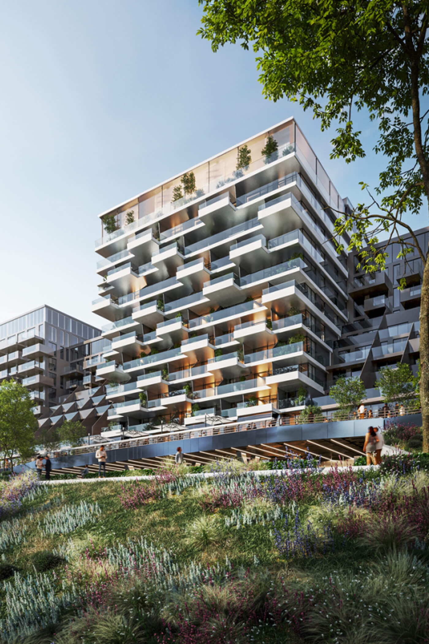
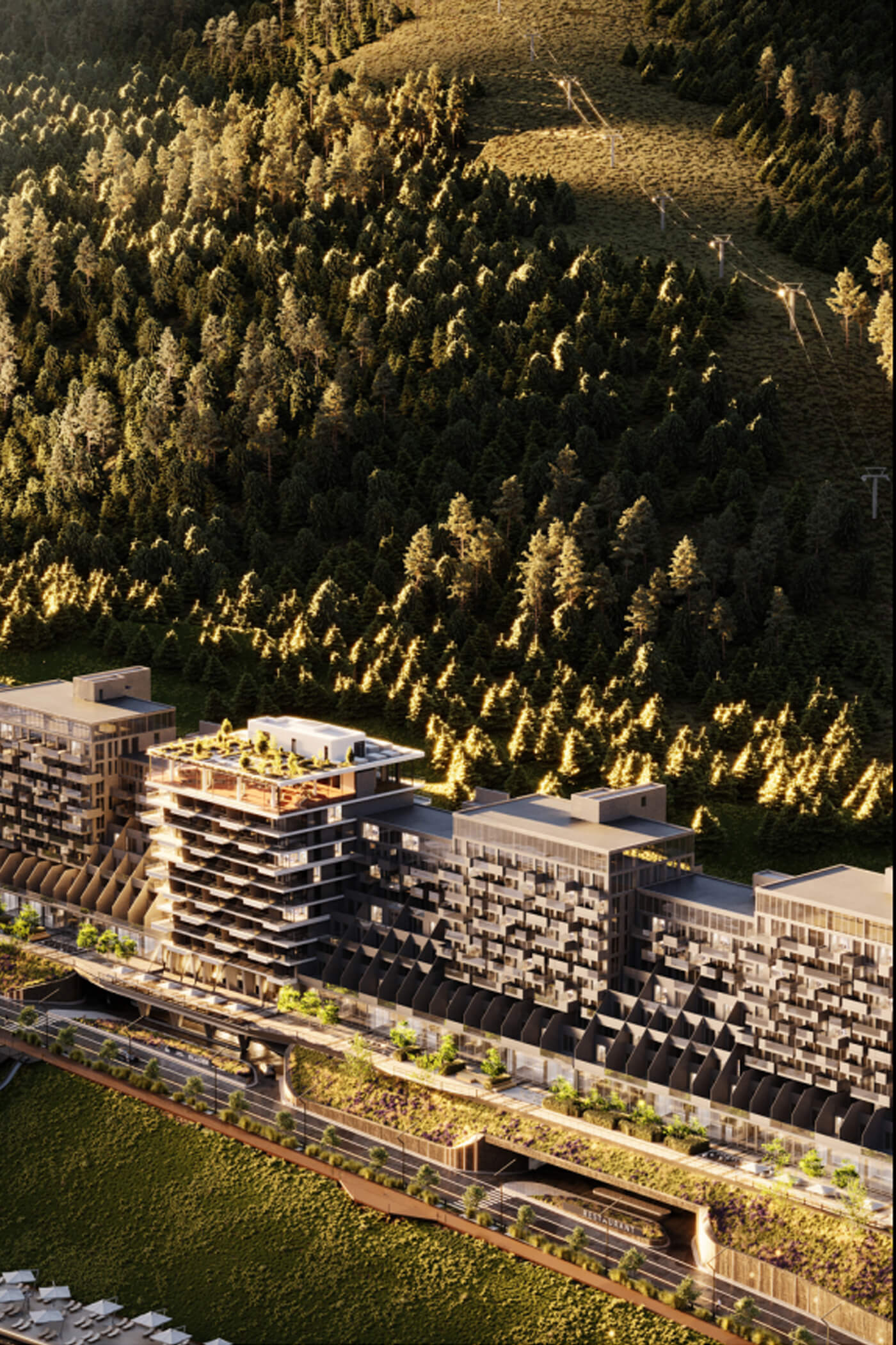
Ресторан Rene розташований у Буковелі, на першому поверсі сучасного житлового комплексу. Локація має багато переваг, але водночас поставила перед нами три серйозні виклики.
1. Краєвид чи функціональність?!
Простір має неймовірні видові характеристики: дві сторони будівлі повністю орієнтовані на озеро та ліс. Однак виник парадокс — основний потік гостей прибуває саме з боку найкращого краєвиду.
Виклик:
Гостям потрібні вхідна група та гардероб. Якби їх розмістили стандартним способом біля входу, вони повністю перекрили б вид, позбавивши основний зал природного освітлення та його головної переваги.
Рішення:
Ми спроєктували вхідну групу як компактний квадратний об’єм, інтегрований безпосередньо в зал ресторану. Щоб уникнути створення візуального бар’єра, стіни вхідної групи виконали зі скла, що дозволило денному світлу проникати глибоко в інтер’єр.
У результаті гості, заходячи до ресторану, бачать не глухі стіни, а фрагмент живого інтер’єру за ними. Саму вхідну групу стилізували з відсиланнями до паризьких вітрин та індустріальної архітектури, перетворивши суто функціональний елемент на виразну архітектурну деталь.

2. Логістика для лижників і комфорт тераси
Безпосередньо поруч із рестораном проходить гірськолижний схил — велика перевага, адже лижники можуть потрапляти на терасу просто зі спуску. Водночас це створило серйозний логістичний виклик.
Виклик:
Головний вхід розташований з протилежного боку будівлі. Відвідувачам у лижному спорядженні довелося б обходити всю будівлю, щоб потрапити всередину. Крім того, тераса не мала окремих санвузлів, а шлях до внутрішніх санітарних приміщень пролягав через увесь ресторан, що було незручним як для лижників, так і для інших гостей.
Рішення:
Ми ухвалили стратегічне рішення створити другий повноцінний вхід безпосередньо з боку схилу. Хоча це дещо зменшило корисну площу залу, ергономіка простору значно покращилася.
Тепер шлях від схилу до столика чи санвузла став максимально коротким, а потоки гостей із вулиці та тераси більше не перетинаються хаотично.
3. Створення глибини простору в основному залі
Приміщення має майже квадратну форму та значну глибину. Дві його стіни є глухими (вони межують із кухнею та ліфтовим холом), що створювало ризик появи «непопулярних» зон для посадки гостей.
Виклик:
Столики біля панорамних вікон із видом на озеро завжди будуть найпривабливішими. Питання полягало в тому, як зробити місця в глибині залу, без вікон, не менш бажаними для відвідувачів.
Рішення:
Ми перетворили це обмеження на творчу можливість. Глухі поверхні стали ідеальним полотном для виразних дизайнерських елементів.
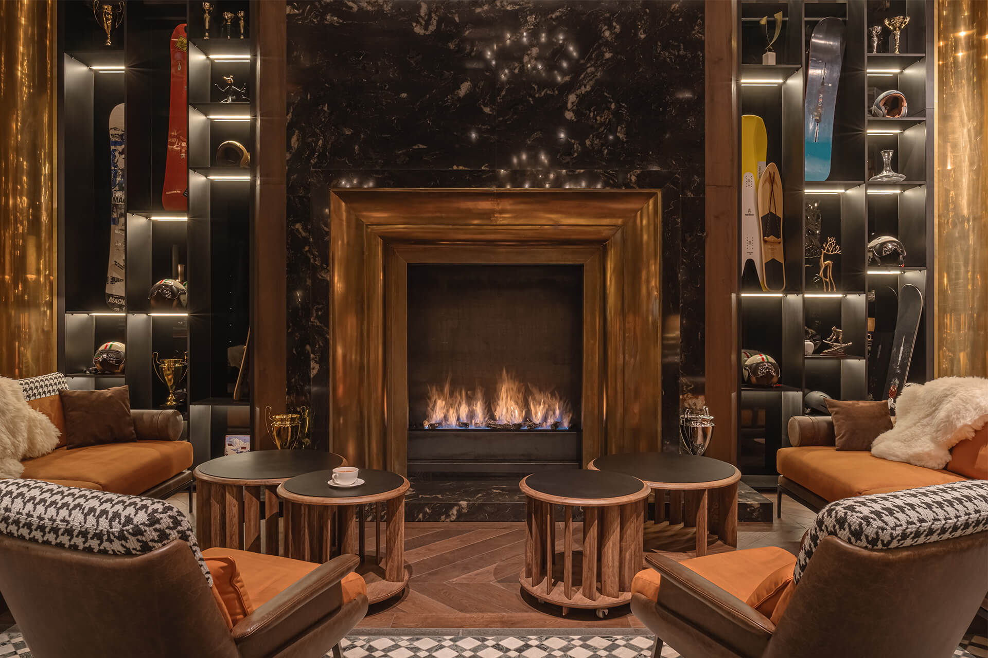
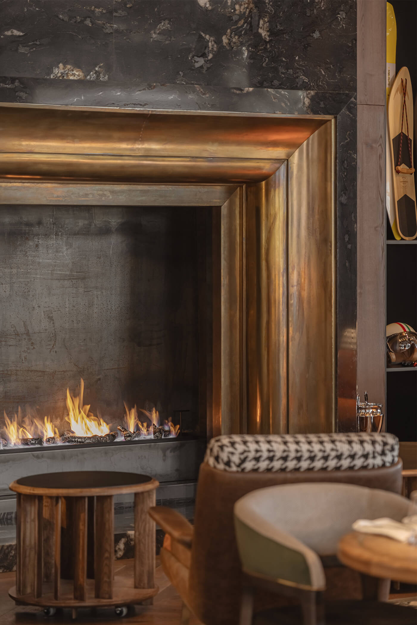
На центральній осі входу ми розмістили великий камін, який одразу привертає увагу та створює відчуття тепла. Поруч з’явився ефектний бар із полицями на всю висоту приміщення, обрамлений стінами з натурального каменю.
Завдяки такій багатошаровій композиції інтер’єру місця в глибині ресторану стали камерними, атмосферними та не менш привабливими, ніж столики біля панорамних вікон.

02.Concept:
Концептуальний етап: синтез альпійського шале та сміливої розкоші
Перші зустрічі з клієнтом поставили перед нами надзвичайно захопливий виклик. Нам потрібно було створити не просто черговий ресторан, а справжню «вибухову суміш»: сучасну інтерпретацію гірського шале — без прямих цитат і кліше.
Простір мав поєднати розкіш, неокласичну елегантність і атмосферу дикої гірської вечірки — вишуканої, дорогої, зухвалої та з легким відтінком декадансу.
Це був один із тих рідкісних випадків, коли клієнт не каже: «Зробіть як у сусідів», а прагне створити абсолютно новий візуальний код.


Виклик: не збитися з обраного курсу
Робота над таким складним поєднанням вимагала значних зусиль. Головний ризик полягав у тому, щоб не витратити тижні на моделювання меблів і створення візуалізацій, а потім почути: «Це не зовсім те, що ми уявляли».
Щоб уникнути такого сценарію, ми ретельно структурували процес роботи.
AI-прототипування
Ми використовували нейромережі (Midjourney) не для створення готових рішень, а для пошуку характеру та настрою майбутнього інтер’єру. Десятки варіацій допомогли знайти точний баланс між теплом дерева та виразністю неокласичних елементів.
Це дозволило клієнту буквально відчути атмосферу проєкту ще до появи перших креслень.
Поступове вдосконалення проєкту
Ми свідомо відмовилися від типового підходу «зникнути на місяць і представити готову концепцію». Натомість рухалися крок за кроком, регулярно зустрічаючись із клієнтом і вдосконалюючи кожен новий фрагмент інтер’єру на основі зворотного зв’язку, отриманого на попередньому етапі.


Чи все пройшло гладко?
Чесно — ні.
Хоча клієнт одразу закохався в настрій, створений AI-концепціями, ми все ж зіткнулися з кількома прихованими проблемами. Бажання швидко перейти до повної візуалізації призвело до того, що на етапі концепції деякі важливі елементи обіднього простору не були достатньо детально опрацьовані.
Наслідки
Це призвело до інтенсивного опрацювання під час фінальної стадії візуалізації. Деякі архітектурні вузли довелося переробляти «на льоту», що подовжило таймлайн і потребувало додаткових ресурсів від команди.
Засвоєний урок
Навіть якщо клієнт у захваті від загального настрою, кожен стратегічний елемент зони має бути підкріплений референсом. Не буквальною копією, а хоча б візуальним вектором.
Сподівання на те, що «все магічно зростеться в процесі» — це ілюзія, яка коштує часу. Ретельна підготовка на старті — єдиний спосіб врятувати нерви та бюджет на фініші.


Project showreel